
This is the 14th installment of my monthly feature on Typewolf where I share my favorite type-driven websites from the previous month and then write a little about the typographic details behind the designs. You can check out last month’s post for February here.
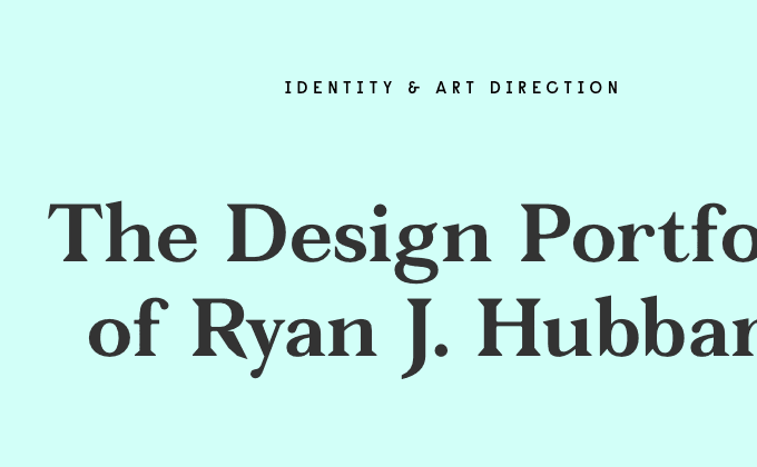
Ryan J. Hubbard
This site uses three typefaces from Colophon Foundry, each of which features a fairly quirky design. The serif Fortescue has a distinctive sharp leg on the R and K which I really dig. Colophon describes the sans-serif Raisonne as “parodic-serious” which is an apt description. It’s a unique design but the legibility suffers at smaller sizes which is probably why the designer chose to use the more legible quirky sans-serif Apercu for body copy.
Random House Books
Surveyor is one of the newer releases from H&Co and the Random House redesign is the first site I’ve come across using it. It’s a great typeface choice that fits perfectly with the site’s fleurons and line work. The combination with the sans-serif Aaux is a little unusual—Surveyor feels so historic and Aaux feels so modern but maybe that is the contrast they were going for. Georgia is used for body copy and I think for the most part it pairs nicely with Surveyor, although in the places where the intro paragraphs are set in Surveyor and then abruptly switch to Georgia can feel a little jarring.
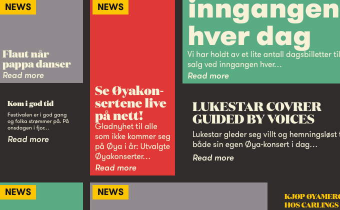
Øya Festival
I love the unusual grid on this site and how the type playfully switches between Domaine Display and GT Walsheim for the headlines and blurbs, as well as mixing up the uppercase and lowercase seemingly at random. Yes, it may be inconsistent but it makes the site feel dynamic and engaging which I think is the point. Although in some places a little more vertical spacing might be needed between the headlines and blurb underneath, as occasionally the descenders and ascenders collide.
Claire & Kyle
This is another site this month using the ever-popular GT Walsheim. I think the typeface lends itself well to this style of open and colorful layout. The use of Caslon set in italics adds a touch of formality to the otherwise playful design.
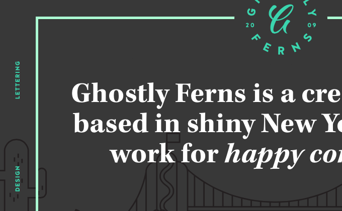
Ghostly Ferns
On first glance, I thought this was yet another site using Brandon Grotesque. However, on closer examination you can tell the sans-serif is definitely not Brandon Grotesque. Although Halis Rounded may have similar rounded terminals, its letterforms are actually shaped quite differently. So kudos to Ghostly Ferns for going with a less-used and more distinctive typeface. The Modern serif Kepler combines nicely with the geometric shapes of Halis Rounded.
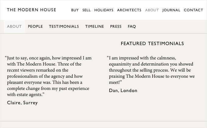
The Modern House
Gill Sans is considered the quintessential British typeface, so it’s a fitting choice for this site about British modern architecture. Old Style serifs such as Minion always make a nice font combination with humanist sans-serifs such as Gill Sans.
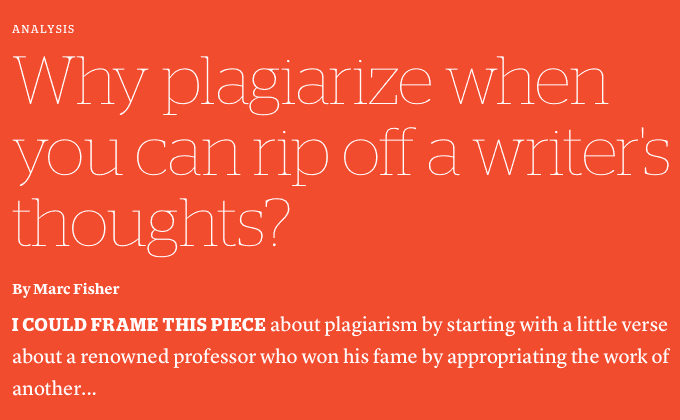
Columbia Journalism Review
Stag is a nice slab serif from Commercial Type that doesn’t seem to be used as much on the web as other slabs like Adelle. The fragile, thin weight of Stag looks refined and crisp when set at large headline sizes like this. Lyon Text, also from Commercial Type, makes a great body serif paired with Stag. It appears that most of the headlines use smart quotes and apostrophes, however, the headline in the screenshot above suffers from an improper straight quote.
Woven Magazine
P22 Underground, a digital version of Edward Johnston’s 100 year-old London Underground typeface, feels much more distinctive than the similar Gill Sans. It was unique for its time and it still feels unique today. A second sans-serif, Tablet Gothic, is used for story headlines and pull quotes, set entirely in uppercase. The body copy is set in the system font Georgia rather than Minion—although Minion is already being loaded, my guess is that the designers didn’t want to add extra page weight by having to load italic, bold and bold italic styles of Minion, which would be required if it were used for body text.
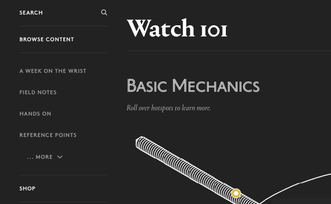
Hodinkee
I really like how this site uses the inline sans style of Portrait combined with the standard serif version—it adds a nice classy touch to the design. A common theme this month seems to be sites using web fonts throughout their site but then sticking with Georgia for body copy—I guess sometimes you can’t beat system fonts performance-wise. And continuing with the Gill Sans theme this month, I just realized the sans-serif Brown actually takes on quite a few similarities to Gill Sans when set in uppercase.
Wired
I’ve heard quite a few criticisms about the new redesign of Wired, mainly that it uses too many different typefaces. The new design uses six typefaces—Ambroise, FF Oxide, Brandon Grotesque, Exchange, Tungsten Rounded and Proxima Nova—when conventional design advice says to never use more than two or three typefaces. That being said, I actually really dig the redesign and think that magazine-style sites like this can get away with a few too many typefaces. Sure, with this many typefaces, a certain amount of consistency is lost, but what is gained is a more interesting and engaging design that encourages exploration. If you flip through a physical magazine you’ll notice it’s pretty common to see a wide range of typefaces used for the various forms of content. I think this redesign is no different and the high-tech demographic of Wired is well-suited to a site that pushes the boundaries of web type.


