
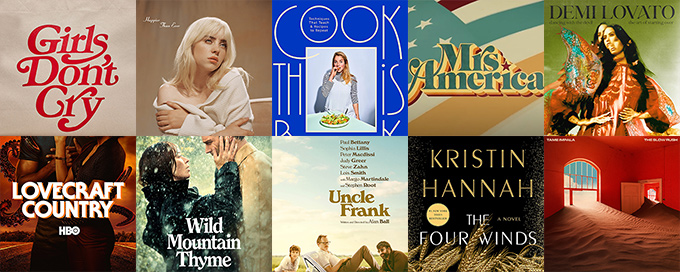
This is the third installment of my blog series on Typewolf, where I identify the fonts used in popular things. The focus here is on anything you might encounter in contemporary visual culture—movie posters, album covers, TV shows, book covers, etc. You can check out the previous edition here.
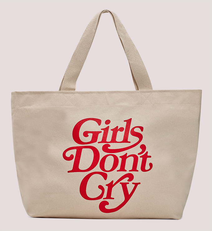
What font does the Japanese fashion label Girls Don’t Cry use?
Tokyo-based fashion brand Girls Don’t Cry uses the font Bookmania for their retro-looking wordmark. Bookmania is Mark Simonson’s digital revival of Bookman that highlights the flamboyant swashes that were popular in the 1960s. The logo appears to be customized, as the curvy tail on the lowercase s isn’t included in Simonson’s version, which contains over 680 custom swash characters.
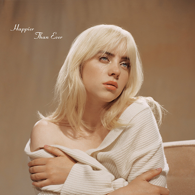
What font does the Billie Eilish album Happier Than Ever use?
Billie Eilish’s 2021 album Happier Than Ever uses the font Coronet for the album cover artwork. The uppercase T in Than is customized here to make the title more legible (it kind of looks like an uppercase J in the original). Coronet gives off a retro 1950s diner vibe and also recalls the 1967 Velvet Underground album featuring Andy Warhol’s iconic banana artwork with his “signature” set in Coronet.
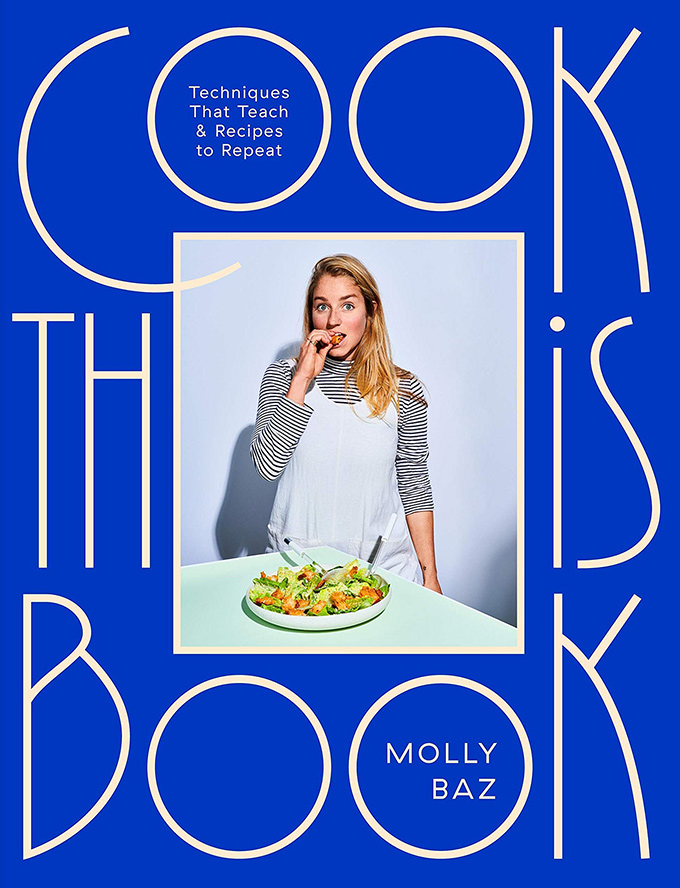
What font does Cook This Book use?
Molly Baz’s 2021 cookbook Cook This Book uses a custom typeface designed by Violaine & Jérémy for the title on the cover. The bespoke type is somewhat similar aesthetically to VJ’s Kobe font, which is used in the interior of the book alongside their typefaces Voyage and Dida. The author name and subtitle are set with Grilli Type’s GT Haptik (using an alternate R), which is also used inside for the book’s body copy.
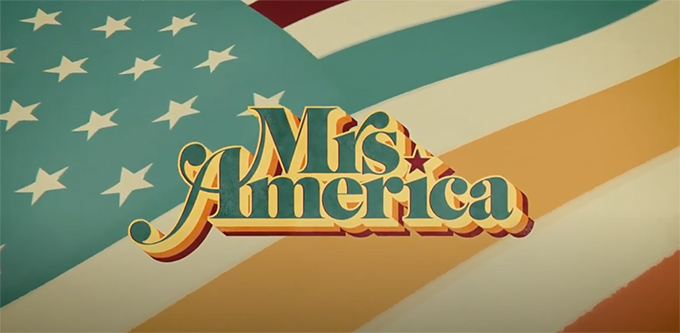
What font does the Mrs America TV series use?
Mrs America, a historical drama TV series produced by FX, uses the font Benguiat Caslon for the main title wordmark. Benguiat Caslon was originally designed in 1965 using phototypesetting technology and later digitized by House Industries. The flamboyant swash caps perfectly evoke the 1970s world that the show takes place in.
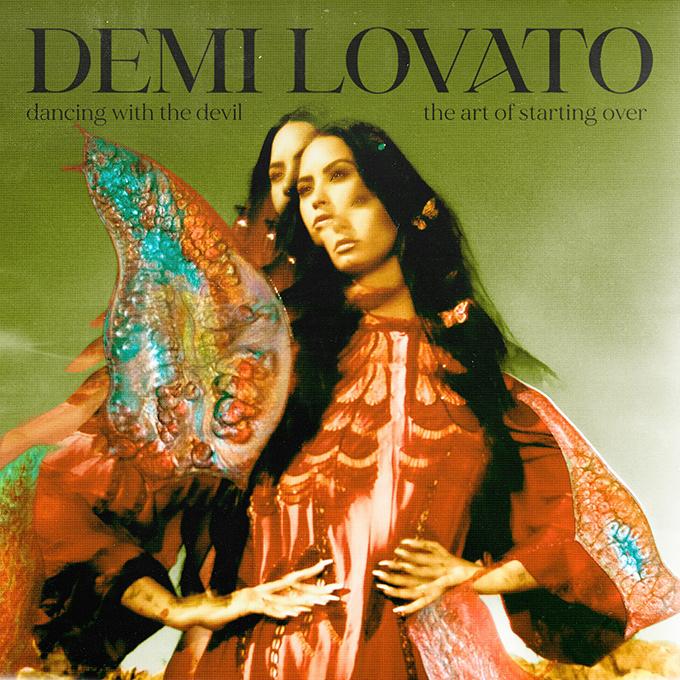
What font does the Demi Lovato album Dancing With the Devil… The Art of Starting Over use?
Demi Lovato’s 2021 album Dancing With the Devil… The Art of Starting Over uses the font Grande set in all caps for the artist’s name and MADE Mirage set in all lowercase for the album title.
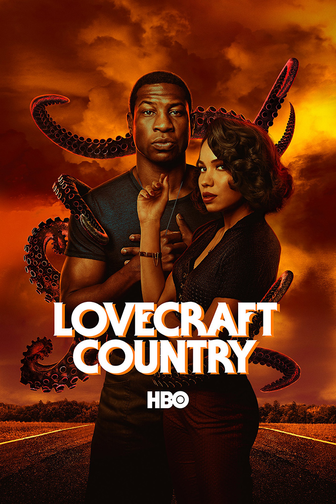
What font does the Lovecraft Country HBO TV series use?
Lovecraft Country, a horror TV series produced by HBO, uses the font ITC Serif Gothic for the title and poster artwork. ITC Serif Gothic was released in 1972 and has been commonly used in slasher and sci-fi flicks ever since. It is set here with a background layer that is slightly offset, giving it a disoriented, blurry effect.
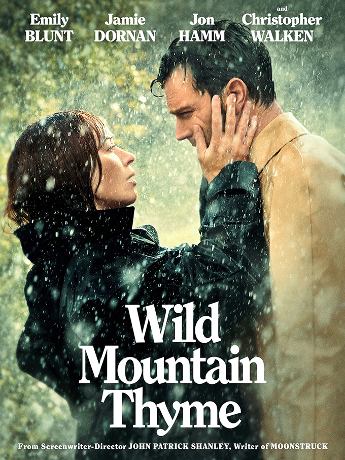
What font does the movie Wild Mountain Thyme use?
Wild Mountain Thyme, a 2020 romantic drama, uses the font ITC Clearface for the poster artwork. The title is set tightly using negative letterspacing, with some letters bumping up against each other.
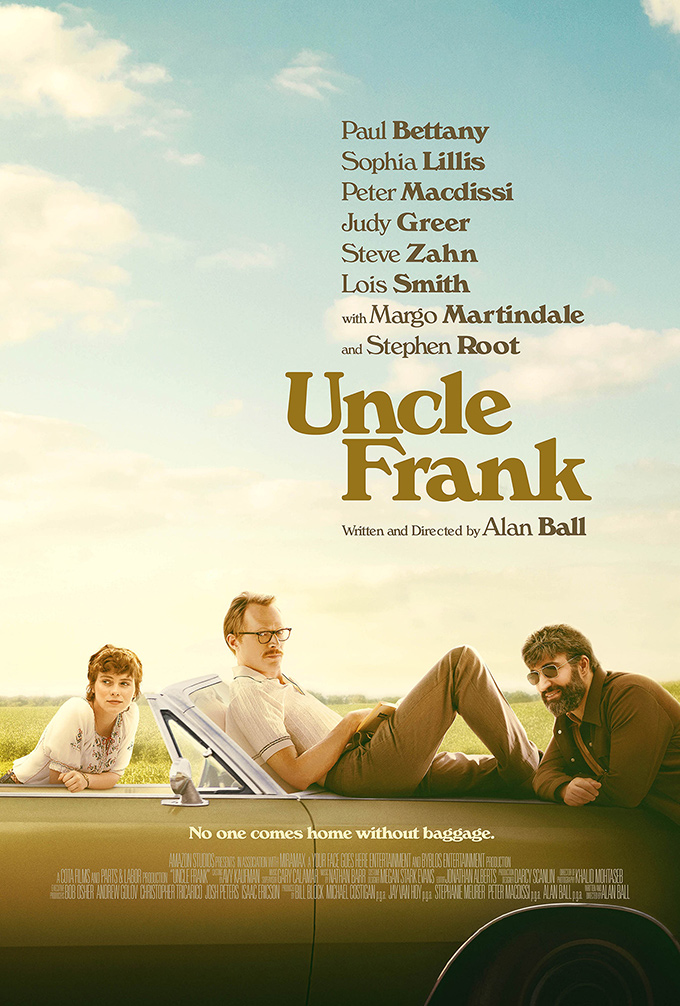
What font does the movie Uncle Frank use?
Uncle Frank, a 2020 comedy-drama released on Amazon Prime, uses the font Windsor for the poster artwork. The film takes place during the 1970s, and Windsor perfectly encapsulates that era. Correction: This actually looks more like Verona, a digital adaptation of Windsor that is slightly less lumpy and has a longer, sharper serif on the “c.” Thanks to Matt Plays for the keen eye!
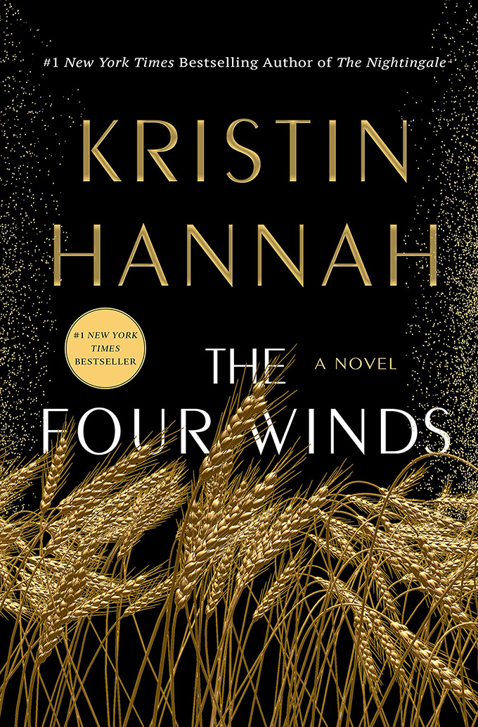
What font does the book The Four Winds use?
The Four Winds, a 2021 novel by Kristin Hannah, uses the font Peignot for the book cover art. When set in lowercase, Peignot is extremely easy to recognize due to its distinctive mix of small caps and traditional lowercase forms. However, when set in uppercase like this, it takes on a much more plain and stoic appearance.
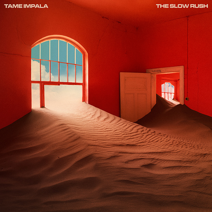
What font does the Tame Impala album The Slow Rush use?
The Tame Impala album The Slow Rush uses the font Microgramma on the cover, a typeface that the band has used consistently on all of their album artwork.
Stay Tuned for the Next Edition
Enter your email in the box below to be notified when I publish a new post in this series. For website design inspiration, check out the Site of the Day section.
I strive to be as accurate as possible with the font identifications, but if you notice any errors, please let me know: jeremiah@typewolf.com.


