
This is the 51st installment of my monthly feature on Typewolf where I share my favorite type-driven websites from the previous month and then write a little about the typographic details behind the designs. You can check out last month’s post for March here.
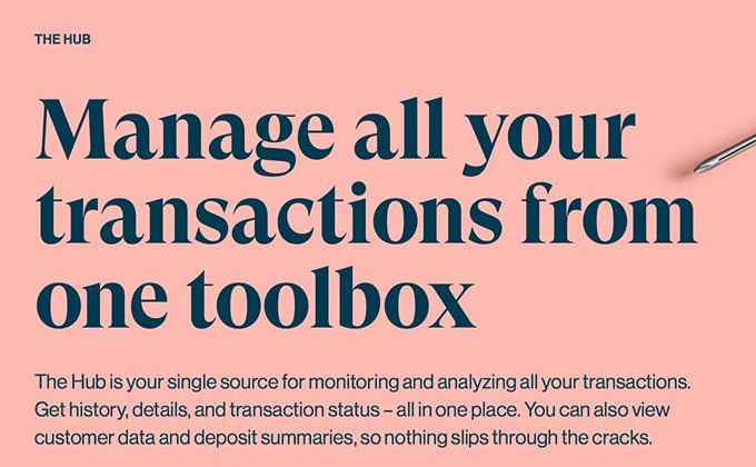
Checkout.com
GT Super was officially released by Grilli Type just a few weeks ago, but some designers have been able to get their hands on the font early as there have been uses on Typewolf going all the way back to mid-2017. My prediction is that this typeface is going to blow up this year. It ticks all the boxes of what is trending with designers right now—high contrast, 1970s-evoking and sharp, blade-like serifs. The Checkout.com brand feels a bit corporate to adopt this look, but it shows that this style is going mainstream.
You might notice that the body text on this site (as shown in the paragraph in the screenshot above) is set pretty tight—the letters and words all seem kind of smushed together. However, it’s not the CSS letter-spacing or word-spacing causing this but the particular version of Neue Haas Grotesk being used. Rather than using the text optical size, everything is set in the display optical size which has tighter spacing built-in. I’m not sure of the reasoning behind this decision, as the type is set pretty small and definitely not used at the kind of large display sizes that would warrant the tighter setting.
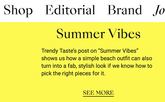
Herb
Eksell Display is somewhat similar to GT Super, mentioned above, with its razor-sharp serifs and general all-around evil appearance. It was originally drawn by someone who was a graphic designer rather than a type designer, which no doubt contributes to its oddball, off-kilter appearance. The body text is set in Commercial Type’s Styrene family which reads surprisingly well despite its quirky features, such as the overly wide crossbars on the t and f, as well as the prominent curve on the J.
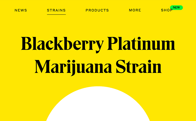
Gaimo
SangBleu Empire, a member of the SangBleu collection from Swiss Typefaces, is yet another typeface that may fall into the “evil serif” category with letters that look like they could be used as weapons. It’s a very distinctive typeface that helps create a strong identity for the Gaimo shoe brand. The pairing with Roboto feels out of place though—it makes me think of Google and their suite of products, as well as generic website templates that rely on the Google Fonts service. Another member of the SangBleu family could perhaps have been used instead to create a more unique visual identity.
Dwell in Other Futures
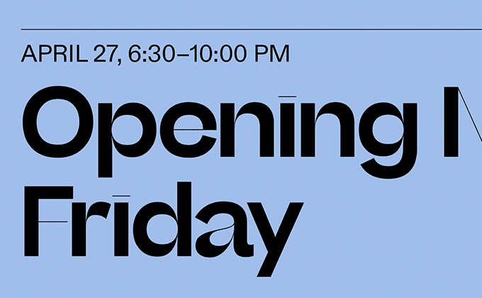
Beatrice Display is a coming-soon release from Sharp Type, so there isn’t much information available on it yet. I’ve noticed lately that foundries have been making their upcoming releases available early to select designers, perhaps to create buzz ahead of the official launch. I’ve seen designers fawning over Beatrice on Twitter, so this strategy may be working.
I think this typeface has a visceral appeal to designers due to its striking visual qualities—the ultra high contrast, hairline horizontal strokes and the dot on the i that is just a straight line. It feels very avant garde. Its real-world usefulness, however, is probably quite limited. The hairline strokes completely disappear at small sizes—even at large sizes they are barely there. But that won’t stop designers from reaching for it in situations where aesthetics and emotional response trump pure readability.
A much more neutral and legible typeface, Programm, is paired here with Beatrice Display. Programm is a sans-serif that originated in the 1960s and has since been revived through Dinamo Standards, a branch of Swiss foundry Dinamo that focuses on revivals and interpretations of forgotten typefaces.


