
This is the 19th installment of my monthly feature on Typewolf where I share my favorite type-driven websites from the previous month and then write a little about the typographic details behind the designs. You can check out last month’s post for July here.
Red Bull Music Academy
Portrait is a serif from Commercial Type that is based off Renaissance forms but with added sharp, triangular serifs. This helps to give the “daily” subsection of the Red Bull Music Academy site a much more classic feel than the main site which feels very modern with its prominent use of the contemporary sans-serif, FF Clan. The type is set really well on the article pages—the line length is narrow and proper apostrophes, quotation marks and dashes are used throughout. I dig how the paragraphs use indents rather than full line breaks—this gives the content more of a magazine feel. Maison Neue, a grotesque from Milieu Grotesque, complements Portrait nicely.
Yours Truly Creative
Austin is another serif from Commercial Type, but this one is influenced by the Scotch Romans of the eighteenth century rather than Renaissance types like Portrait. Instead of pairing Austin with another Scotch Roman for body copy (such as Georgia), the designers chose to combine it with Brix Sans, a contemporary sans-serif. This gives the site a more modern, twenty-first century feel. Brix Sans was designed by Hannes von Döhren of Brandon Grotesque fame, however, this is the first time I’ve seen Brix Sans used on the web, in contrast to Brandon Grotesque which is absolutely everywhere.
Ian Alexander Williams
Calligraphic serifs like GT Sectra seem to be super popular at the moment. They look especially nice on high-density displays where the sharpness of the pen-derived details really stand out. The warm, quirky grotesque Apercu and it’s monospaced counterpart, Apercu Mono, contrast nicely with the sharp angles of GT Sectra.
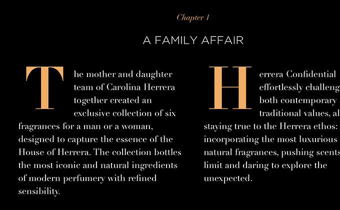
Carolina Herrera Confidential
Didot is a dangerous typeface to use for body copy, especially when set reversed on a black background—the high contrast and delicate strokes can be quite harsh on the eyes. That being said, for a perfume brand like this I’d imagine the brand image is more important than pure readability. Didot looks refined and sophisticated combined with Gotham and the body copy is fairly minimal, so I think this site can get away with it.
Venamour
Freight Big is another high contrast serif with delicate strokes, however, this design luckily doesn’t use it for body copy. The headers mix the italic style of Freight Big with the roman style, creating an elegant look. The navigation and body text is set in Brandon Grotesque, which runs a little on the small side, but still remains legible.
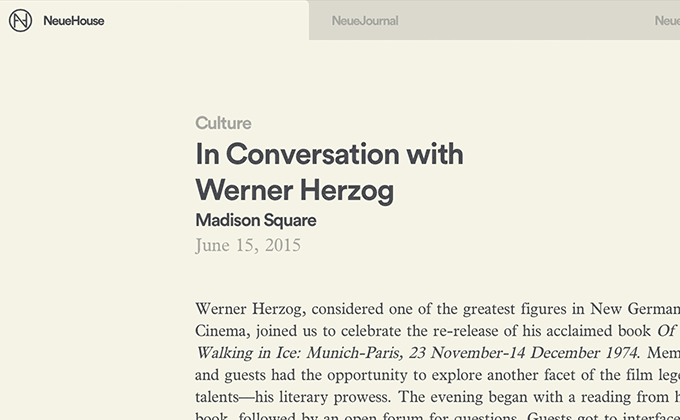
NeueHouse
Lineto’s geometric sans-serif Circular is one of the most trendy typefaces of the moment and it’s used here set in bold for the headers. Plantin is used for body copy, but unfortunately just the roman style is loaded, so faux italics occur throughout the site. You can see in the image above that the italics look rather butchered—the letters are simply sloped rather than using the flowing, cursive design of the true italics. The letter a that remains double-story and the f without a descender are usually dead giveaways of faux italics in serifs.
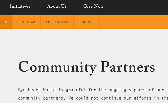
Eye Heart World
Pairing an Old Style serif like Caslon with a monospaced typeface like Letter Gothic is an unusual approach but it immediately gives this design a unique look and establishes a strong brand identity. The one thing I have to call out is the use of dumb quotes rather than smart quotes—in the body copy it’s not as noticeable but in some of the headlines it really jumps out.
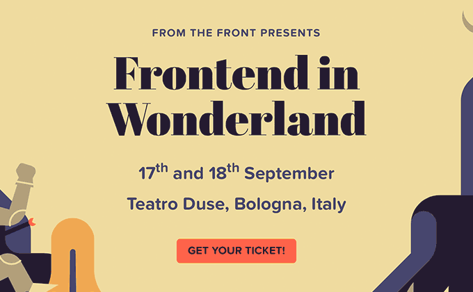
Frontend in Wonderland
The display version of Abril has such extreme contrast between thick and thin strokes that it needs to be used at pretty huge sizes to remain legible. Fortunately this site uses it strictly for headlines where it has a dramatic impact. Proxima Nova Soft is used for everything else—its soft, rounded corners harmonize perfectly with the rounded shapes used in the illustrations.
2015 Brand New Conference
This site is a little heavy on the font loading side—my web inspector shows that 13 different font files were downloaded. But for a site catered to designers, the strong impact made by the diverse use of type may justify the load times. H&Co’s new Obsidian typeface features software generated shading and highlighting and looks absolutely stunning. The pro version of Georgia is used for navigation, subheaders and body copy—it includes a light weight not found in the standard system font version. The sans-serif P22 Underground is used for small amount of auxiliary text throughout.
Owltastic
Meagan Fisher’s new redesign shows off the amazing versatility of TypeTogether’s Abril typeface family. The text styles of Abril fall into the Scotch Roman genre but as the weights get heavier, the typeface starts to feel more like a slab serif in the style of Clarendon. The display styles take on more of a Didone quality, especially evident in the high contrast “fatface” style used for the section headers. Even as the design of Abril shifts to different genres, the letterforms still feel harmonious. Montserrat, a free font available on Google Fonts, is used for navigation set entirely in uppercase with a touch of letterspacing.


