
This is the 49th installment of my monthly feature on Typewolf where I share my favorite type-driven websites from the previous month and then write a little about the typographic details behind the designs. You can check out last month’s post for January here.
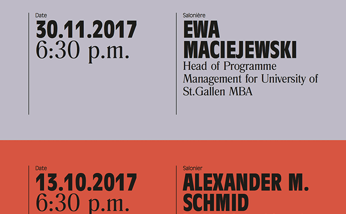
Creative Leadership Salon
Antique Olive is a unique typeface in that it has reverse stroke contrast, meaning the horizontal strokes are thicker than the vertical strokes. This is the opposite of standard typefaces, which gives the letterforms a wonky, off-balanced feel. Here, a condensed cut is set entirely in uppercase which makes the reverse contrast not quite as noticeable. The “evil serif” Romana is paired with it, which starkly contrasts with the quirkiness of Antique Olive.
Smalls
Nimbus Sans, a Helvetica-inspired neo-grotesque, is the sole type family used on the Smalls website. The navigation and subheaders use an extended cut set in uppercase, which helps create hierarchy and breaks up the “sameness” of using a single font.
The lowercase text has added letterspacing, which is usually considered a typographic faux pas. I’ve noticed other sites doing this lately and it feels like it is starting to become somewhat of a trend. To me, this loose typesetting gives designs an almost childlike quality, feeling friendly and open like a learn-to-read book.
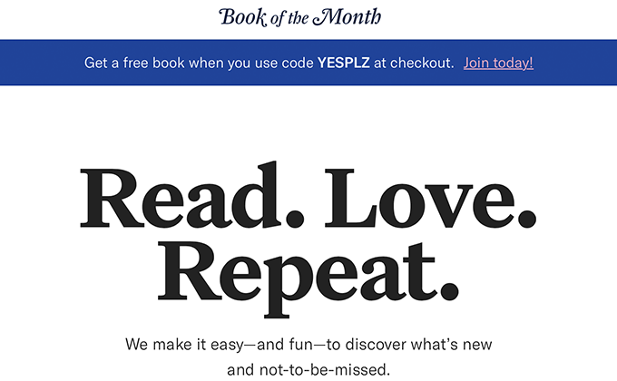
Book of the Month
Kris Sowersby of Klim designed Untitled Serif to be a neutral book face that blends into the background. So it is interesting to see it used here as a prominent display face. Graphic designers always end up using typefaces in ways not originally intended by type designers. Grilli Type’s GT America is used for the rest of the site, while the logo is set in Farnham Display italic, showing off some of the gorgeous swash characters.
WePresent
ITC Clearface continues to be popular as of late—it made an appearance on the recent Chobani rebrand and has been featured quite a bit on Typewolf recently. I feel like it’s losing some of its retro associations and starting to feel contemporary again. I credit OKREAL with helping to revitalize this typeface, as their influential site design from 2014 made prominent use of it (in addition to being one of the first sites to do the whole colored-text-on-a-colored-background thing).
The WePresent site may have possibly been inspired by OKREAL but manages to do its own unique thing. The headlines mix in the sans-serif Fakt mid-sentence, giving a distinctive look to the story titles. And I love how some of the stories are individually art directed with their own custom color palettes. The body text is set beautifully in a readable line length with proper apostrophes, quotation marks and dashes used throughout.


