
This is the 24th installment of my monthly feature on Typewolf where I share my favorite type-driven websites from the previous month and then write a little about the typographic details behind the designs. You can check out last month’s post for December here.

Dreams Incarnated
Apercu may have been the second most popular font of the year on Typewolf, but I’m still encountering clever and interesting uses of it. Its quirky characters create a stark contrast with the sharp, angular forms of Noe Display. The triangular serifs in Noe Display play off nicely with the triangular shapes in the illustrations, creating a nice harmony between the type and imagery.
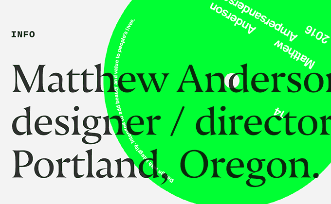
Matthew Anderson
Nocturno Display is another typeface with heavy, triangular serifs, but compared to Noe Display, its serifs are less angular and more concave. Matthew Anderson pairs it here with the monospaced typeface Nitti from Bold Monday. The blockquotes use proper quotation marks, apostrophes and dashes which are important when setting large type like used here.
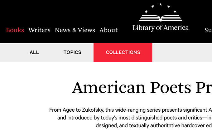
Library of America
Arnhem is one of my favorite body text typefaces and it was created with editorial usage in mind, so it’s a great choice for such a literary site. It’s set here for both the headlines and body copy, with Calibre from Klim Type Foundry used for auxiliary text. The color scheme is almost entirely grayscale except for small splashes of type set in red, which helps to draw the eye down the page.
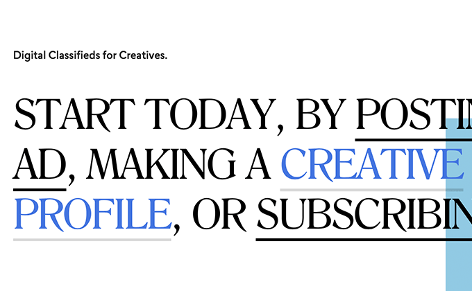
ilovecreatives
Romana is the same serif typeface I use on Typewolf, so it’s always interesting seeing it used on another site. It’s set mostly in uppercase on the ilovecreatives site and it takes on quite a different feel than when set in mixed case—I love how the sharp leg of the uppercase R reaches below the baseline. Lasiver, a geometric/humanist hybrid from Type Dynamic, makes for a nice combo with Romana.
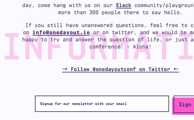
One Day Out
Realtime Rounded is a monospaced typeface that has never been featured on Typewolf before, so it’s cool to see a brand pushing the boundaries a bit and going with something not commonly used. The rounded corners help give it a more friendly and less techy feel compared to other monospaced fonts. The entire site uses just a single typeface but the designers did an excellent job of mixing things up by using different weights and sizes. The section headers set in uppercase screened against the background is a nice touch.
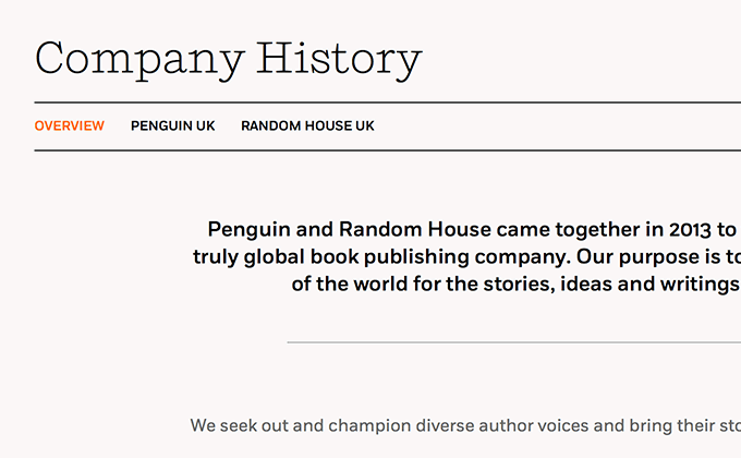
Penguin Random House UK
The recent redesign of the Penguin Random House UK website uses two typefaces designed by Jeremy Mickel, Shift and Fort. Shift is the same typeface used in the Penguin Random House logo, so it’s great to see it carried throughout the rest of the design which really helps to unify the brand. The type is set really well overall, however, there are a few places where the body copy line length gets a little wide for comfortable reading, especially on a large monitor. I love the logo but it’s super fuzzy on my Retina display—creating a 2x version implementing srcset would be a quick and easy fix. Other than those two nitpicks, I think this redesign is very well done.


