
This is the 26th installment of my monthly feature on Typewolf where I share my favorite type-driven websites from the previous month and then write a little about the typographic details behind the designs. You can check out last month’s post for February here.
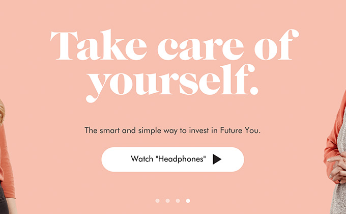
Wealthsimple
Chunky, 1970s-looking serifs like Caslon Graphique have become really trendy in the last few years, especially when combined with geometric sans-serifs like Futura. It’s a pretty hip look for a wealth management company, but their brand looks to be directed towards young people, so it feels like a good fit. I like how they carry the same Caslon Graphique type from their logo throughout the site in the headlines. I also like how they set their name as Wealthsimple rather than Wealth Simple or WealthSimple—I’ve always thought that using just one word creates a stronger brand and avoids the problem of awkward capitalization in the middle of the name.
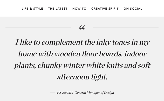
Sheridan Life
Notice anything odd about the type in the above screenshot? Look closely at the large italic type in the quote. And then compare it to the small italic type in the quote attribution. Does something look off? Chronicle Display from Hoefler & Co. has gorgeous italics but unfortunately you are looking at faux italics in the quote. True italics in serifs have a flowing, calligraphic appearance, rather than looking like they were just simply skewed at an angle. An easy way to spot faux italics is to look at the lowercase f—most italic serifs will have a descender on the f. I really love this site but just thought the faux italics were worth pointing out. Everything in the design is ultra clean and minimal and Avenir pairs beautifully with Chronicle.
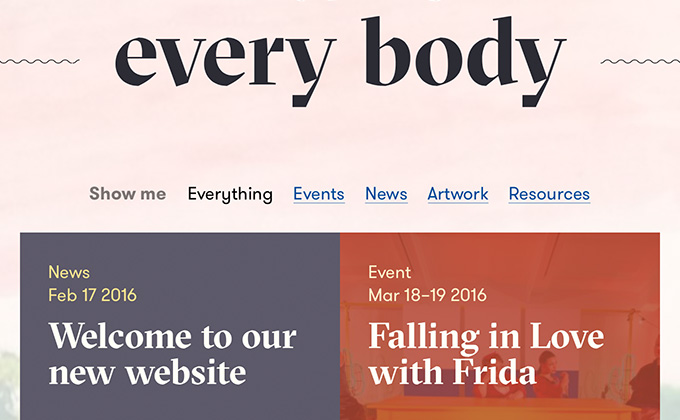
Arts Access Victoria
This site has quite a bit of type set on top of photos but fortunately the designers have created a nice system for darkening and tinting the photos to ensure the overlaid text is still readable. So even if the client ends up choosing poor photos later, it still shouldn’t create any legibility issues. GT Sectra and GT Walsheim are polar opposites—GT Walsheim is fun and quirky while GT Sectra feels more serious and sinister—but they pair surprisingly well together.
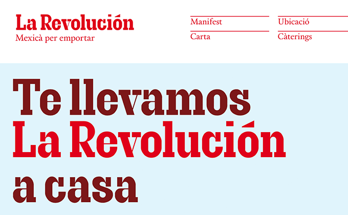
La Revolución
Choosing such a distinctive and underused typeface like Granite is a dead-simple way to create a unique and memorable brand. This high-contrast slab stands out and grabs your attention much more than a commonly used slab like Clarendon ever would. The serif paired with it, Calendas Plus, is actually available as a free font with a “pay what you want” model to get the complete family.
Malditos
If the serif typeface used here, Stanley, reminds you of Times New Roman, that’s because it wears its influences on its sleeve and is in fact named after the creator of Times, Stanley Morison. It differs quite a bit from Times though and features sharper triangular serifs. Univers pairs well with it as neo-grotesques tend to pair well with serifs in the Transitional genre. The scrolling banner text (WE ARE MALDITOS!) is a bit obnoxious but I think that is entirely intentional.
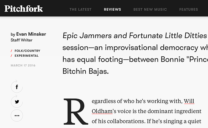
Pitchfork
I’ve been a daily reader of Pitchfork since 2000, so it’s been interesting to watch the site evolve over the past 15+ years. Their last redesign was in 2011, so this has been a long overdue update.
The use of Klim Type Foundry’s Tiempos Headline and Tiempos Text is a welcome replacement of the default system fonts that Pitchfork have been using forever. The sans-serif, Walfork, is actually a customized version of GT Walsheim that Grilli Type created just for Pitchfork. Walfork features a single-story a and does away with the curvy tail on the y that helped give GT Walsheim so much personality. But I see how those features could draw too much attention and potentially be distracting.
There are a couple of small things about the redesign that bother me, such as the tiny type on the homepage (it’s been forever since I’ve seen 10px type used on the web) and the use of dumb quotes everywhere rather than smart quotes, but overall I really love how this turned out. The drop caps on the articles are a nice touch and the layout feels open and inviting with the prominent use of whitespace.


