This is the 28th installment of my monthly feature on Typewolf where I share my favorite type-driven websites from the previous month and then write a little about the typographic details behind the designs. You can check out last month’s post for April here.
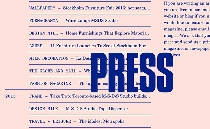
MSDS Studio
I wasn’t even aware that a monospaced version of Century Schoolbook existed until I saw this site. At first, I just thought it was a version of Century Schoolbook with bad kerning due to the weird spacing around the uppercase i characters. Monospaced fonts often have spacing issues—especially noticeable around narrow letters—which can give them a crude appearance. Here, I think the crude look is intentional. The monospaced and proportional versions of Century Schoolbook create an interesting contrast, with the monospaced uppercase letters feeling like they were stamped out by a typewriter. The page titles are set in Compacta and fade in and out over top of the content, which is a nice touch.
NYC Pride
Leitura Display, from DSType, is a high contrast design with tight spacing, so it looks great set at large sizes for the headlines on the NYC Pride site. Avenir is used everywhere else and contrasts nicely due to its low stroke contrast. The line height on the text underneath the title on the homepage is set a little tight and the type set in uppercase would probably benefit from some added letterspacing, but overall the typography on this site is top notch.
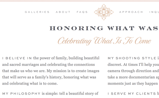
Deborah Zoe Photography
Engravers is a popular typeface that I’ve seen a lot in print, but this is the first time I’ve seen it used as a web font. It naturally pairs well with Sweet Sans as both typefaces share similar squat, wide letterforms. In the places where Engravers spans more than a line of text, it starts to become a little hard to read due to its high contrast, but it makes up for that with the dramatic emotion it exudes. The beautiful script face Tangier is used sparingly for subheaders and adds a delicate touch to the design.
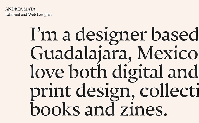
Andrea Mata
I love the contrast here between the large type set in Nocturno Display and the small type set in Caslon. Both typefaces belong to the Old Style genre, so they work well together, but the flared serifs of Nocturno are distinctive enough to make the typefaces still contrast with one another. The navigation is set in Nevis, a free font that shares a lot in common with Gotham. The kerning in Nevis isn’t great (“CONTACT” looks like “CONT ACT”), so the design may have been better off just sticking with Caslon and Nocturno.
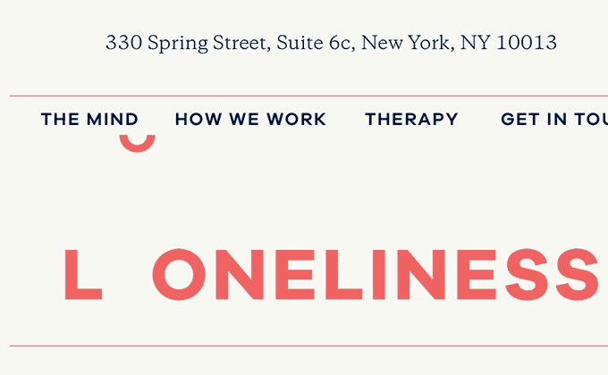
Mindwork
Each psychological condition on the Mindwork site has a clever typographic treatment applied to it—the L in Loneliness is set apart from the rest of the letters and the D in Depression is rotated upside down to form a frowny face. Attempting this kind of cleverness can be dangerous as inevitably there will be a word that you can’t think of a good concept for, but I think the designer here was able to pull it off admirably. The uppercase type is all set in Galano Grotesque, a geometric sans from René Bieder. The body copy is set in Galaxie Copernicus with slight letterspacing added—usually it’s a typographic faux pas to letterspace lowercase but with the small amounts of copy set at a large size, I think it works okay.
Papazian
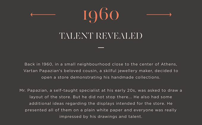
This is another site this month with letterspaced lowercase, although in this case it may not be intentional. If I had to guess, I would say the uppercase type had letterspacing added to make it more readable and then the lowercase body copy inherited that style inadvertently. Especially since there are sections where the letterspacing on the body copy is removed. But that nitpick aside, I really dig the type on this site. AW Conqueror Didot is a beautiful face with such dramatic stroke contrast that it almost feels like a stencil cut, but it’s usually not used for more than a few words, so it still remains legible. Gotham pairs perfectly with it as geometric sans-serifs always look good with serifs from the Modern genre.


