
The recent relaunch of Google Fonts prompted me to revisit their library with the hopes of uncovering some new and interesting typeface pairings. These are my five favorites that I discovered.
This collection focuses on newer and less commonly used typefaces, rather than Google Fonts staples like Open Sans and Merriweather. Each of these five pairings includes a headline face that should be used at large sizes and a body face with a large x-height, low contrast and included italics. I also write about why these typefaces work well together, so it is more than just a collection of pretty fonts.
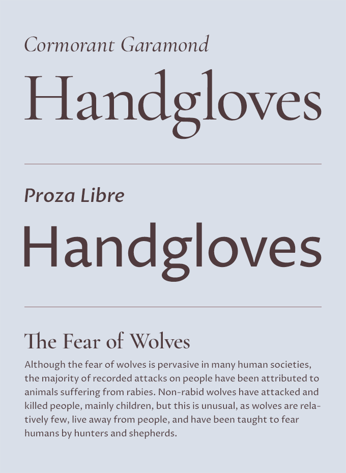
1) Cormorant Garamond & Proza Libre
The Cormorant family is a more lavish and extravagant take on the classic Garamond types, created with display usage in mind. Cormorant contains “scandalously small counters”, so it’s not recommended as a text face. The Cormorant Garamond variation includes larger counters but still works best in a display setting. Proza Libre is a humanist sans-serif that was specially designed to render well on screens, so it’s an ideal partner for Cormorant. Humanist sans-serifs naturally pair well with Old Style serifs and both designs have a strong calligraphic feel that ties them together.
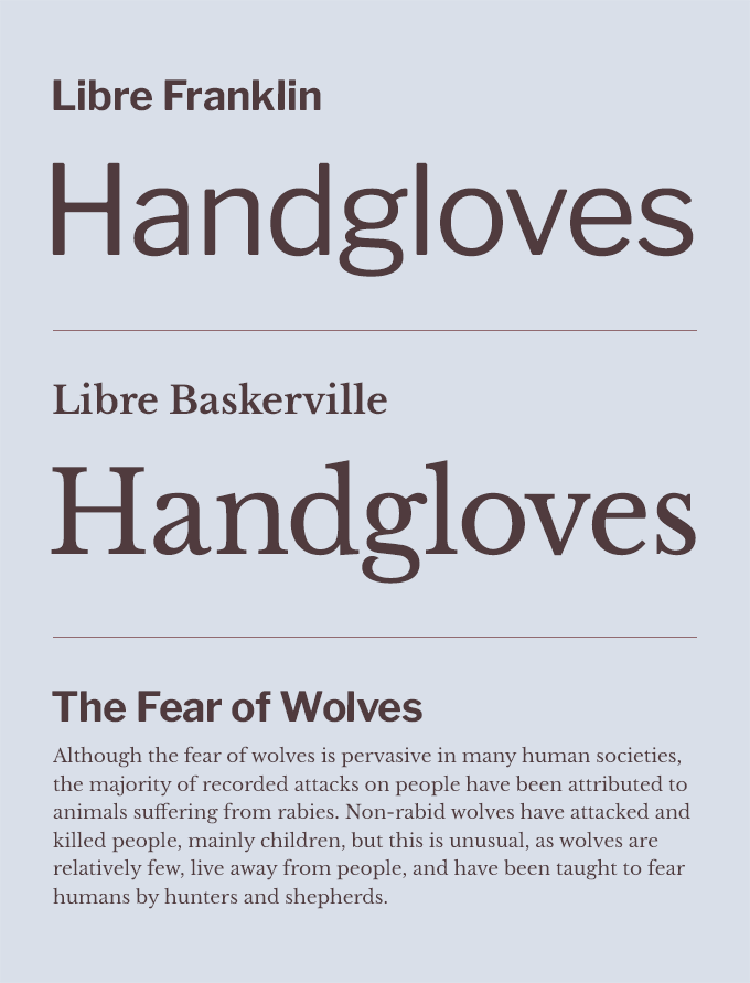
2) Libre Franklin & Libre Baskerville
American Gothics like Franklin Gothic and Transitional faces like Baskerville have been paired together for over 100 years, so these libre revivals make for a classic combination. Both were designed by Pablo Impallari from the ground up to be optimized for use on screen. Libre Baskerville reads well and Libre Franklin contains an impressive nine weights which make it versatile as a headline face. This is a perfect combination for evoking an established and traditional feel.
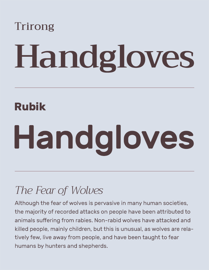
3) Trirong & Rubik
Rubik is far from a classic book face with its heavyset geometric skeleton and rounded corners, but it actually reads fairly well for body text—the x-height is large, the letterforms render clearly and it includes normal, italic, bold and bold italic styles. I wouldn’t set a book with it, but it can work for short blocks of text on the web. Trirong shares a similar geometric skeleton with a vertical axis and wide proportions, so it feels harmonious next to Rubik. The italic of Trirong is a bit more distinctive than the roman, so it may be the better option for display usage.
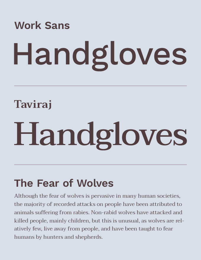
4) Work Sans & Taviraj
Work Sans does not contain italics, unfortunately, so that pretty much rules it out for any kind of serious text setting. But it contains plenty of character and personality to shine as a headline face, especially in the heavier weights. Taviraj, from Thai foundry Cadson Demak, is better suited as a text face and its wide proportions play well with the wide spacing in Work Sans. The almost teardrop terminals on the a and g add a friendly touch that plays off the quirky letterforms of Work Sans.
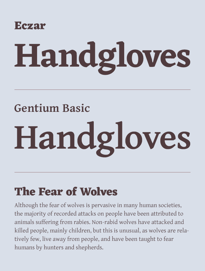
5) Eczar & Gentium Basic
Pairing two serif typefaces is often considered bad practice, but I think this is a case where we can get away with breaking the rules of typography. Eczar and Gentium Basic share an extremely similar structure, yet they are different enough to still contrast with one another. Notice how the shapes of the letterforms follow the same basic skeleton—the angle of the beak of the e is even similar. Yet each typeface plays to different strengths—the shapes of Gentium Basic are simpler which make it clearer at small sizes; Eczar is more complex with dramatic calligraphic features that are more noticeable at large sizes. Together, they perfectly complement each other and allow for much more expressive typography than if you were to use either of the typefaces alone.
If you dig through the Google Fonts library, I’m sure you can find many more perfect pairs like I found above. Be sure to check out my curated collection of Google Fonts to discover more of my favorite open-source typefaces.


