
This is the 31st installment of my monthly feature on Typewolf where I share my favorite type-driven websites from the previous month and then write a little about the typographic details behind the designs. You can check out last month’s post for July here.
Binary Cargo
Grad is a really nice serif from Mark Simonson that is available on Typekit, but for some reason just doesn’t seem to be used that much on the web. So it’s great to see it featured so prominently on the Binary Cargo site. It’s combined here with Colophon’s Aperçu and Aperçu Mono. The use of color is excellent and really helps make the type pop. My only nitpick with the site is the use of straight quotes rather than proper apostrophes, which you can see in the above screenshot.
Helms Workshop
Shift is unique for a slab serif in that the lighter weights feel like a typewriter face while the heavier weights take on the appearance of an Egyptian slab. The middle weights are used here, so it feels like something in between. The sans-serif Arquitecta is paired with Shift, set entirely in all caps. The type on the case study pages is set well with proper dashes and apostrophes, however, the paragraphs stretch to the full width of the browser window, which makes the line length a little long for comfortable reading on large screens.
Southbound 2016
This is my first time encountering the typeface Fabrik, so at first I thought there was something wrong with the font rendering on the site due to the way the bowls on the lowercase e and a are sliced off. But it turns out that design feature is intentional. It’s a strange effect that is pretty distracting, however, it is also memorable, which is sometimes what you want for display type. Simplon Mono, from Swiss Typefaces, is paired with it and works a little better for body copy.
Magpie
Normally I’m not a huge fan of type set on top of photos as it usually ends up becoming illegible unless the chosen photo is perfect. But for the most part, this site does an excellent job of ensuring enough contrast between the photos and type for the text to remain readable. I love the use of Hera Big—its quirky curves and prominent ball serifs make it perfect for a branding face. The body text, set in Avenir, has quite a bit of letterspacing applied to it. I’m not sure if that is intentional or just CSS inheritance gone awry.
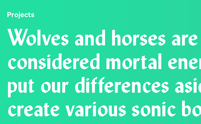
Full Force Wolf Horse
Full Force Wolf Horse have pretty much the best name for a studio I’ve ever heard. The copywriting on the site is brilliant as well and plays off the whole wolf/horse thing—“Wolves hunt in packs. Horses also hunt in packs. Both animals are quality team players (and vicious killers).” MPI Sardis, a calligraphic sans-serif that is similar to Lydian, is used for the logo and section intros, while the rest of the type is set with Calibre. I think it would have been nice to see MPI Sardis used at least a little on the homepage as well to help tie it into the design more.
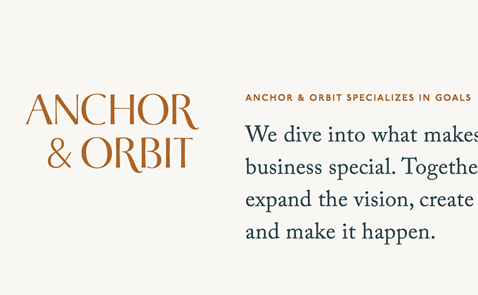
Anchor & Orbit
The Anchor & Orbit site is one of my favorite sites that I’ve featured on Typewolf in quite awhile. The type perfectly complements the mood set by the warm colors and simple line art. The headers use P22 Underground set in uppercase with generous letterspacing and Caslon is used for the larger headlines and body text. Old Style typefaces like Caslon almost always pair well with humanist sans-serifs like P22 Underground. Inconsolata, a monospaced font that is available for free on Google Fonts, is used for the small amounts of auxiliary text. The logo is set in Cotoris—I had thought the uppercase R was customized but it turns out it’s just using a stylistic alternate that is part of the font. Typefaces that include sets of alternate glyphs are always great choices for logos as they allow you to really customize the type for a unique look.


