
This is the 30th installment of my monthly feature on Typewolf where I share my favorite type-driven websites from the previous month and then write a little about the typographic details behind the designs. You can check out last month’s post for June here.
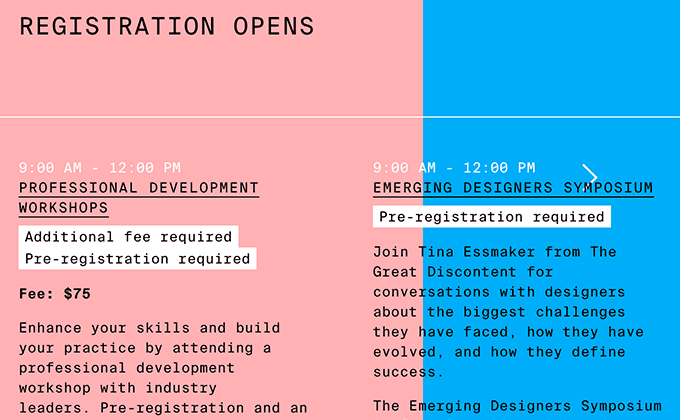
AIGA Design Conference
Just a single monospaced family, Suisse Int’l Mono, is used on the 2016 AIGA Design Conference site, but they manage to get a lot of mileage out of it. When set in uppercase with wide tracking, the typeface loses some of its monospaced feel and comes across more like a traditional neo-grotesque. Type is set vertically in places to create even more typographic contrast. The split color layout adds boldness to the design, yet the type still remains legible.
An Interesting Day
Larish Neue is a quirky serif from Radim Peško that contrasts starkly with Atlas Grotesk, a more traditional grotesque from Commercial Type. Both typefaces feature squat descenders which helps tie them together. The use of color is really great on this site as well—it shows that colored type on a colored background can still be perfectly readable.
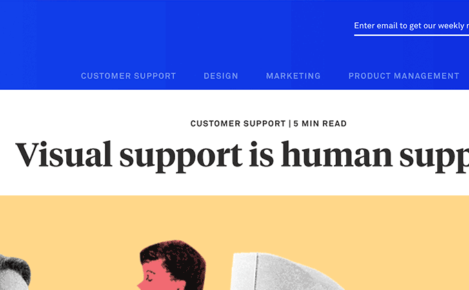
Inside Intercom
The blog section of Intercom pulls in the use of Akkurat from the rest of the site but adds in the serif typefaces Tiempos Headline and Tiempos Text, which gives the blog more of a newspaper feel. I think they did an awesome job with this, but there are a few things worth mentioning. First, the line length on the articles is a little long, coming in around 100 characters, which is a bit over the 66 character “ideal.” Second, there are prominent faux italics throughout the articles, which shows that it’s always a good idea to load italic (and oftentimes bold and bold italic) styles whenever you are setting large amounts of body copy.
Oliving the Life
This is yet another site this month with excellent use of color. The serif Cheltenham exudes vintage warmth when set against the soft pastel backgrounds. Theinhardt balances it out with a more modern touch. The logo looks like real hand lettering but is actually set in Madina Script, which is an impressive accomplishment for a script face. Proper apostrophes are used throughout the site as well.
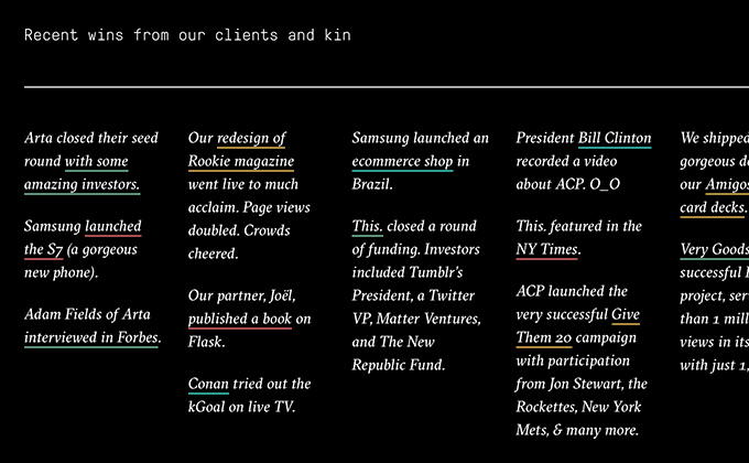
Fictive Kin
Fictive Kin use two typefaces from Grilli Type—the calligraphic serif GT Sectra and the rounded, monospaced GT Pressura Mono. Typically, a calligraphic serif would be used as a display face and a monospaced font would be used for auxiliary text, but this design takes the exact opposite approach—GT Pressura Mono is featured prominently as the main typeface, while GT Sectra is used sparingly for accents. It’s an interesting approach that makes the design feel fresh and unique. The multi-colored link underlines add a nice splash of color and keep the white-on-black homepage from feeling too stark.
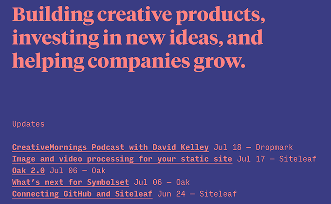
Oak
The Oak site brings even more monospaced goodness to this month’s favorite sites with its use of Input Mono. Input Mono is known as an excellent programming font (it’s actually available as a free download to use privately in your coding app), but here it is used as the main text face. It reads surprisingly well for the short amounts of copy on the site and even the blog section, with its longer articles, still reads perfectly well. The bold weight of Klim Type Foundry’s Tiempos Headline adds a nice human touch that prevents the design from feeling too much like a computer terminal.


