
This is the 29th installment of my monthly feature on Typewolf where I share my favorite type-driven websites from the previous month and then write a little about the typographic details behind the designs. You can check out last month’s post for May here.
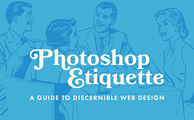
Photoshop Etiquette
Bookmania, Mark Simonson’s Bookman revival, contains over 680 swash characters and you can see a nice handful of them used here on the Photoshop Etiquette site. The retro type perfectly complements the early-1960s evoking illustrations. Uppercase Futura is used as well, which helps with this whole vintage aesthetic. I’m glad the designer chose to set the body copy with Bookmania, rather than Futura, as it works well as a text face when set without the ornate swashes.
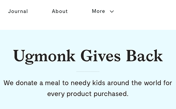
Ugmonk
Larish Neue is a distinctive serif that is full of quirks, making it an excellent choice as the main display face for the Ugmonk rebrand. Moderat, a clean geometric sans from Tightype, contrasts nicely with the asymmetrical shapes of Larish Neue. Both Larish Neue and Moderat are better suited for display usage, so the default system font Georgia is used for body copy. A more unique serif than Georgia probably could have been chosen but that would require loading in additional fonts for normal, italic, bold and bold italic which could make the site a little too webfont heavy.
Good Bytes
The chunky super weight of FF Bau is used for the large headlines here set in uppercase. A second typeface, Calibre, is used for the smaller uppercase headers, most likely because the super weight of FF Bau is too thick to remain legible at smaller sizes. The line length of the body copy set in Aperçu Mono expands with the width of the browser window, so on large screens it becomes a little difficult to read comfortably, but with the minimal amounts of copy used it isn’t too big of an issue.
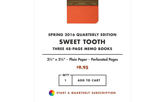
Field Notes
The From Seed page on the Field Notes site features a showcase of vintage promotional booklets from the agricultural industry that clearly shows the roots of the iconic Field Notes typographic aesthetic which is based around Futura bold. It’s a great page to bookmark and revisit next time you are craving some vintage type inspiration. The new Field Notes site redesign pairs Century Schoolbook with Futura which is a fine choice as it perfectly matches their brand aesthetic and serifs in the Modern or Rational genre naturally pair well with geometric sans-serifs.
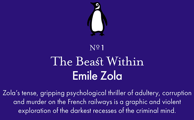
Pocket Penguins
Mrs Eaves is one of the first serifs I learned to identify early in my design career and has been a favorite of mine since. It contains beautiful ligatures which you can see on the st in the above screenshot. Fonts from Emigre are now available on Typekit so I imagine we’ll be seeing Mrs Eaves used a lot more on the web. The type on the Pocket Penguins site closely matches the type on their book covers, although the Futura on the book titles looks to be set a little tighter than on the site.
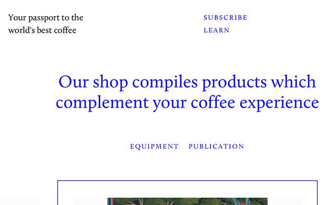
Collected Coffee
Fivethousand Fingers is one of my favorite studios as they always do amazing work with a strong focus on typography. Their latest project for Collected Coffee looks absolutely gorgeous and uses just a single typeface, Calluna. The vivid blue type really makes the design in my opinion—without it, the identity would just feel a little too stark and generic. Sometimes just adding a splash of color to type can make a huge difference.


