
This is the 47th installment of my monthly feature on Typewolf where I share my favorite type-driven websites from the previous month and then write a little about the typographic details behind the designs. You can check out last month’s post for November here.
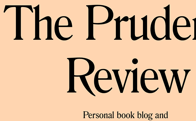
Designer That Reads
This site is set entirely in Romana with everything center-aligned all the way down the page. The designer implements a super simple trick here that has a huge impact on the site’s typography—rather than letting text flow freely, manual line breaks (<br>) are inserted to break up the lines into readable chunks. This prevents awkward line wrapping and words floating by themselves. I definitely wouldn’t recommend using this technique on paragraphs, however, for large display type like this (and especially for centered text), it can be a nice touch that improves the flow of reading.
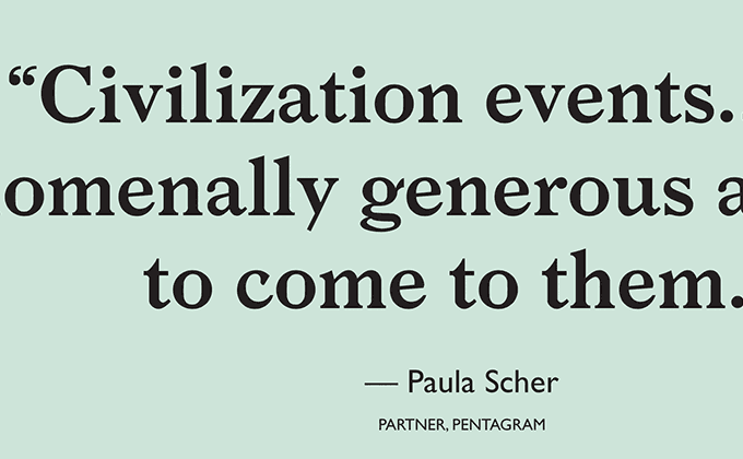
Civilization
Larish Neue is a chunky serif with thick stems and heavy, bracketed serifs. Its quirky letter shapes pair nicely with the eccentric forms of Gill Sans, especially with the letter a which feels top-heavy in both typefaces. The quotes here are set well with proper quotation marks and em dashes, although the uppercase text below the quote attribution may benefit from a slight amount of added letterspacing.
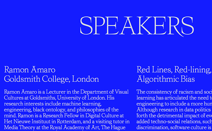
Pre_Invent
Tacite is a distinctive typeface with long, spindly serifs that give off an evil sort of vibe. All of the type here is set tightly, with the paragraphs using a line height of just 1.2, which is much lower than the oft-recommended value of 1.5. This tightness gives the layout an uneasy, claustrophobic feeling which may very well be what the designers are intending to evoke.
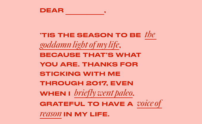
Holiday Correspondence Aid
A wide cut of the sans-serif Druk is paired here with an italic cut of the Old Style serif Quarto. Mixing typefaces in mid-sentence is a challenge, but the designers here did an admirable job. The x-height of Quarto matches up perfectly to the cap height of Druk, which creates an even texture to the paragraph.


