
This is the 53rd installment of my monthly feature on Typewolf where I share my favorite type-driven websites from the previous month and then write a little about the typographic details behind the designs. You can check out last month’s post for May here.
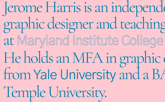
Jerome Harris
This site uses two freely available open-source fonts—the serif Cormorant and the sans Gothic A1—but still has a distinctive look. The headline type is set tightly with negative letterspacing, recalling the tight-but-not-touching vibe of 1970s typography. The designer of Cormorant actually commented on Twitter how he wasn’t a fan of the tight setting here, but I think it matches the look of the rest of the design and gives the type a less formal and more raw aesthetic.
Long Lean Club
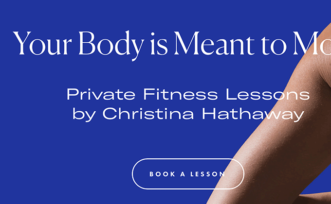
Canela and GT America are two of the hottest typefaces of the moment, and they are both combined here. I really love the overall branding—the logo, type choices, colors and photography all feel spot on. However, I feel like the execution on the website could have been better. The paragraphs extend the full width of the browser window, which makes reading difficult on a large screen. And the introduction of a second sans-serif here—Futura—feels unneeded. Perhaps a different width or weight of GT America could have been added instead to keep the design more cohesive.
An Interesting Day
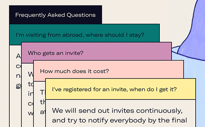
Norwegian design studio Bakken & Bæck host a one-day conference every year, with each event getting its own unique website design. This is the fourth feature on Typewolf (check out the 2017, 2016 and 2015 versions), so it’s an interesting way to watch design trends evolve over the years.
The 2018 site is a perfect representation of what is on trend at the moment—wide-bodied sans-serifs, heavy borders and quirky illustrations. An extended cut of GT America is used throughout with an even wider expanded style used for the main headline. Will the extended sans still be all the rage next year? We will have to wait and see…
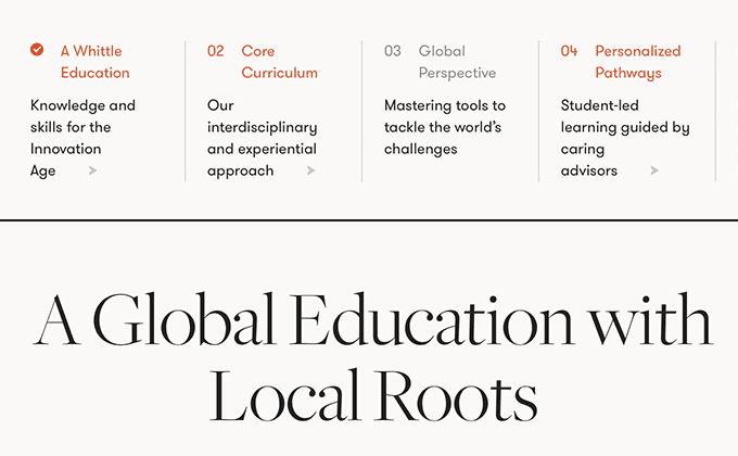
Whittle School & Studios
I get the occasional complaint from people who think I feature too much harsh, brutalist-inspired design on Typewolf while passing over anything that takes a more timeless and classy approach. The Whittle School & Studios site should please this group. Nothing about it feels overly trendy—it’s just solid typography executed in a tasteful manner.
The huge headlines set in the Big optical size of Freight contrast nicely with the smaller text set in GT Walsheim. GT Walsheim is a unique geometric sans that is full of personality, but it still reads quite well at smaller sizes. And it helps that the line lengths of the paragraphs are kept at a narrow, readable width that fits nicely in the oft-recommended 45–75 characters per line range.


