
This is the 22nd installment of my monthly feature on Typewolf where I share my favorite type-driven websites from the previous month and then write a little about the typographic details behind the designs. You can check out last month’s post for October here.
Buca Boot
Eksell Display is the only typeface that famed Swedish designer Olle Eksell ever completed. It’s a striking and unique design—the top of the lowercase f looks like a flame blowing in the wind and the lowercase r doesn’t look like any other I can recall seeing. Going with a unique typeface like this is a sure way to make a brand stand out and be memorable. The sans-serif, Edmondsans, is a quirky cross between a grotesque and a geometric and feels like a perfect match with Eksell Display.
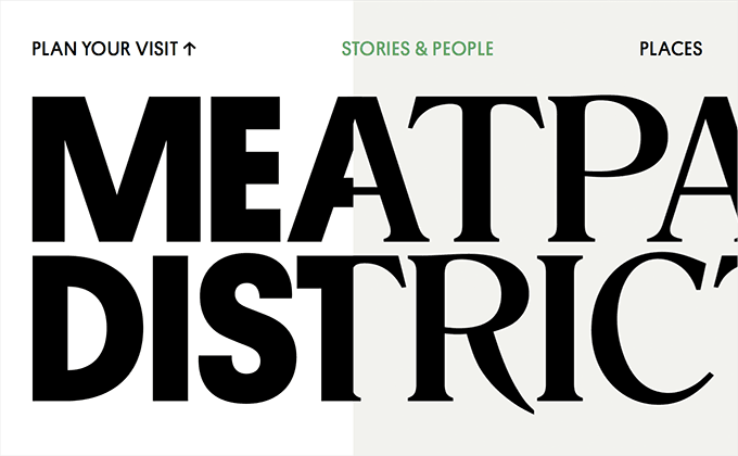
Meatpacking District
The new identity for NYC‘s Meatpacking District neighborhood melds two typefaces together—Platform and Romana. If Romana looks familiar that’s because it’s the typeface I use for the Typewolf logo and headers in this article. The website does an excellent job of carrying through the dual font identity, although the use of Arial for body copy does feel a little blah. Neither Platform nor Romana would really work as body text though, so I understand why they went with a system font.
Turo
RelayRides recently rebranded themselves as Turo with a new identity and website. I really dig how the new site turned out as it is very type-focused. The website does a great job of setting out a system for using type and then sticking with it consistently. The large headlines are set in Freight Display, a condensed cut of Plantin is set in uppercase for the subheaders and the body text uses Colophon’s new grotesque, Basis Grotesque.
Grand Ferdinand
The website for the Austrian hotel Grand Ferdinand keeps making me think of Wes Anderson’s The Grand Budapest Hotel. Something about it shares the same classy meets eccentric quality. I think Radim Peško’s distinctive serif, Larish Alte, reallys helps give it that feel. Galaxie Copernicus is used for body copy and complements Larish Alte nicely. Effra is set in uppercase for subheaders and a fourth typeface, Hoefler & Co.’s Knockout also makes an appearance set in uppercase as well.
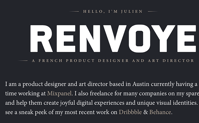
Julien Renvoyé
I remember using ITC Conduit quite a bit on various design projects in the mid-2000s. I hadn’t seen it used as a web font before so I was stoked to see it used on this site. It’s one of those typefaces that, for whatever reason, designers tend to set in uppercase more often than lowercase. It’s an intentionally crude looking typeface but pairing it here with Minion gives it a surprisingly elegant feel.
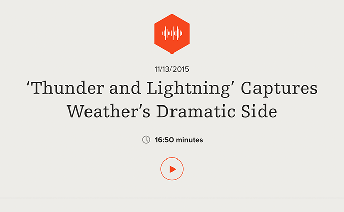
Science Friday
This is the first site I’ve featured on Typewolf that uses Egyptienne, a slab serif by the legendary Adrian Frutiger. His Avenir typeface is used everywhere but other than Univers you don’t really see his other typefaces used all that much as web fonts which is a shame. The use of Egyptienne immediately gives the design a more distinctive feel as it looks quite a bit different than other popular slabs such as Sentinel and Adelle. If the use of Proxima Nova on this site looks a little off to you, it’s because they are implementing the alternate character version—notice the single-story a and the curvy tails on the letters l and y.
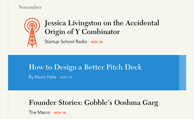
The Macro
When I think of Y Combinator I can’t help but think of Hacker News and its Reddit-esque, designed-by-a-programmer-in-1997 aesthetic. So I was pretty surprised to see how beautiful and well-designed their new publication The Macro is. It’s clean and modern with a strong focus on typography. The articles, set in Avenir, are a pleasure to read with a narrow line length and generous line height. This is the first site I’ve featured on Typewolf that uses New Caledonia which is a popular book serif. It’s interesting that New Caledonia is used here as a display face for the article titles and pull quotes rather than as a body face. Avenir is highly readable though for a sans-serif and New Caledonia looks refined at large sizes so I think this approach definitely works.


