
This is the ninth installment of my monthly feature on Typewolf where I share my favorite type-driven websites from the previous month and then write a little about the typographic details behind the designs. You can check out last month’s post for September here.
Generation Press
Poynings is a nice stencil typeface from Colophon Foundry, although it doesn’t seem to be available for purchase on their site. It’s most likely a custom face as Generation Press use it for their print collateral and their studio is located in a town called Poynings. Hopefully it will be available as a commercial typeface someday. The sans-serif Graphik is used for body copy on their site as a stencil face isn’t really optimal for reading. Courier Prime, a free monospaced font, is used sparingly as well.
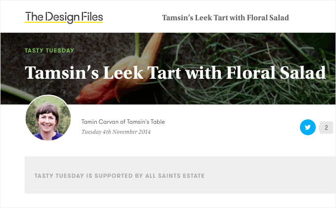
The Design Files
Utopia has been a fairly popular serif workhorse family in the print world for years but I rarely see it used on the web. It’s combined with Pona, a more modern serif workhorse. Utopia and Pona are fairly similar, so it’s hard to say why the designer decided to combine two different serifs. Utopia is used only for the headlines so my guess is it looks a little more distinctive at large sizes. The geometric sans GT Walsheim helps to give the design a bit more of a modern feel.
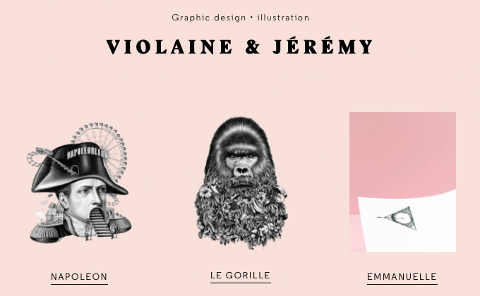
Violaine & Jeremy
The poster cut of Stanley is used for Violaine & Jeremy’s logo, while the geometric sans Regular is used for body copy. Regular is interesting in that it was originally designed as a slab serif but was later reworked into a sans-serif. The classic serif Caslon is interspersed throughout as well. Setting the nav text vertically is a nice touch, which is probably a little more readable than simply rotating it 90 degrees as is often done for this type of effect.
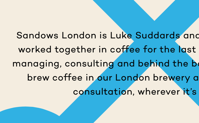
Sandows London
Campton, a recently released geometric sans, was a perfect typeface choice for this design. The shapes of the letterforms work well with the geometric shape from the Sandows London logo used throughout the site. The Google font Source Code Pro is used as well, although it looks like it might be suffering from faux bold in the footer.
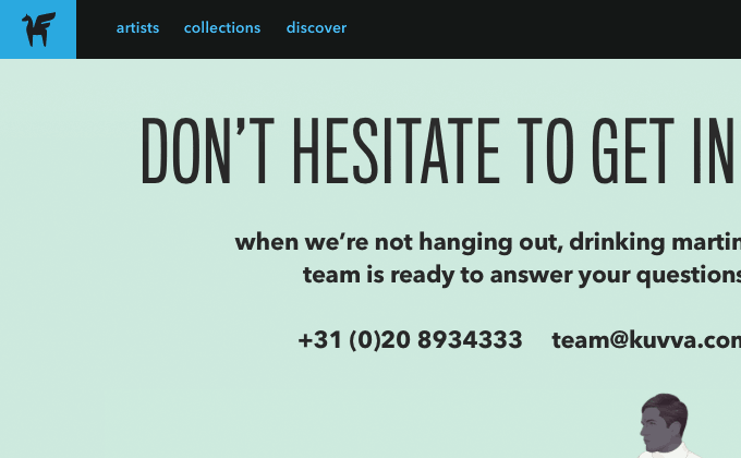
Kuvva
Kuvva’s site implements an interesting type system, setting the condensed Titling Gothic entirely in uppercase and setting Avenir entirely in lowercase. This helps to establish a clear contrast between the two sans-serifs.
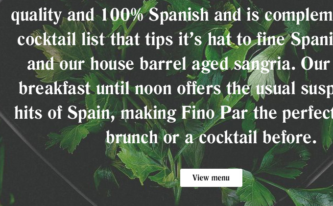
Fino Par
Romana is a serif typeface that dates back to 1860 and it looks absolutely beautiful on Fino Par’s site. Life is another serif with similar characteristics to Romana but works a little better as a body font which is probably why the designer decided to introduce a second serif.
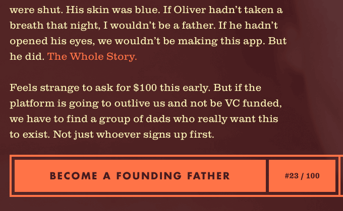
Future Father
I’ve always loved the combo of Clarendon and Futura. The warmth of Clarendon just contrasts so nicely with the cold modernism of Futura. The colors on this site perfectly complement the type as well. The logo is set in the beautiful and ornate Bookman Swash.
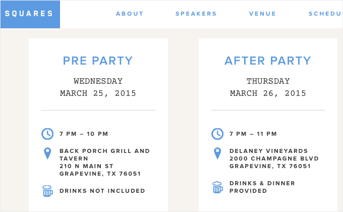
Squares Conference
Proxima Nova is used so much on the web that it can tend to feel a little stale and boring. However on the Squares Conference site it feels fresh combined with the geometric sans Blender and the monospaced Courier Prime.
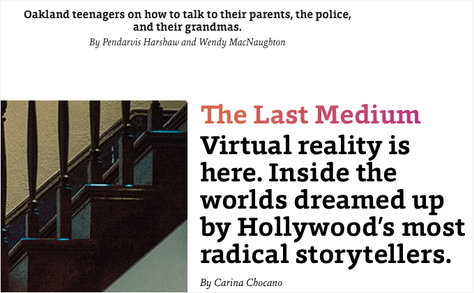
California Sunday
California Sunday’s site makes use of three typefaces that I had never seen used on the web before—the slab serif Foro, the serif Sina Nova and the sans-serif Equip. All three were designed by Dieter Hofrichter of Germany-based Hoftype. I love when a site goes for less-commonly used typefaces—it immediately makes the design standout and feel more distinctive.
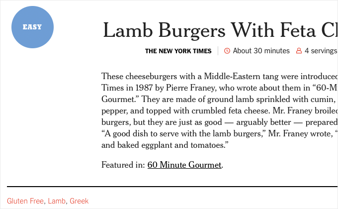
The New York Times Cooking
The New York Times have been using Cheltenham as a headline face for over 100 years, so it’s nice to see it used on the web in their Cooking section. Cheltenham is used sparingly, mostly for headlines and short descriptions, but it really helps to establish the NYT brand. The slab serif Karnak is used for headers and the rest of the type is set in the classic newspaper face Franklin Gothic.


