
This is the 43rd installment of my monthly feature on Typewolf where I share my favorite type-driven websites from the previous month and then write a little about the typographic details behind the designs. You can check out last month’s post for July here.
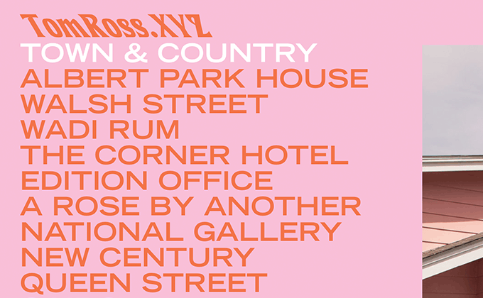
Tom Ross
This site is more type-focused than your typical photographer’s portfolio which helps to set the mood before the visitor actually explores any of the photos. The logo is set in Introspect, a hippie-esque font that was popular in the 1970s—it’s actually the same font used in the Albertsons grocery store logo, but here it’s artificially skewed to the left in a reverse italic style which makes it less recognizable. Extended cuts of fonts have been trending lately, but we usually see neo-grotesques used like Helvetica Neue and Nimbus Sans. So seeing something from the gothic genre, like Trade Gothic used here, is a bit different.
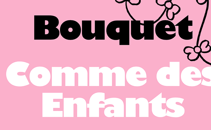
Mile-End
I almost didn’t recognize the display face used here as Gill Sans—the ultra bold style is so different from the rest of the family that it no longer feels like Gill Sans. When font weights get super heavy like this, all kinds of compromises need to be made to prevent the counters from filling in and to keep the letterforms legible. The dot on the i is tiny and the distinctive lowercase double-story g is changed to a single-story version.
Normally mixing another sans-serif with Gill Sans wouldn’t provide enough contrast, however, here Basis Grotesque provides more than enough of contrast with the fat Gill Sans. The body text is set justified which you don’t see all that often on the web. It creates a nice even edge for the text but comes at the expense of inconsistent word spacing, especially without hyphenation.
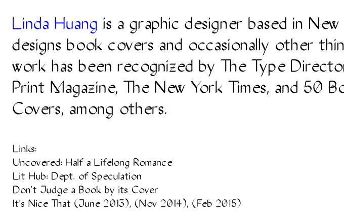
Linda Huang
Linda Huang has an amazingly good collection of book covers in her portfolio which shows type being used in all kinds of clever and creative ways. The font used on her site, The Stroke Sans, is unique as well. It draws on similar calligraphic influences as Frauen, the font I used for my own personal portfolio, but combines that style with a “computer-generated” pen stroke. Notice the unusual connecting strokes on the letters w and M. It’s definitely a distinctive font, however, the kerning looks to be a little off—notice the gaps in the words graphic and covers in the above screenshot.
Sarah Sampsel
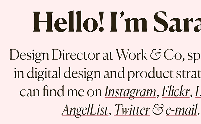
Most designers are aware that the optimal line length for reading is between 45 and 75 characters, however, it still seems most sites have paragraphs that are much wider than that recommendation. So it’s refreshing to see a site that sticks to the lower end of that range. The two column grid helps with this, but rather than draw a line all the way down the middle of the page, the content breaks out from the grid which makes the layout feel more dynamic. The headlines are set in Canela, paired with Freight Text for body copy and uppercase Freight Sans for smaller headers.
TASTE
Upstatement always does awesome design work and their new site for TASTE is no exception. The type pairings here are really well thought out. The serif Tusar is used for the large titles. Tusar has lots of character but isn’t very body text friendly due to its quirks such as the tight aperture on the letter a. Domaine Text has similar proportions to Tusar but reads much better, so it’s paired with Tusar for body text. GT Eesti rounds out the design, set entirely in uppercase. Together the three type families feel very cohesive, with everything sharing a similar sophisticated, early twentieth century aesthetic.


