
This is the 42nd installment of my monthly feature on Typewolf where I share my favorite type-driven websites from the previous month and then write a little about the typographic details behind the designs. You can check out last month’s post for June here.
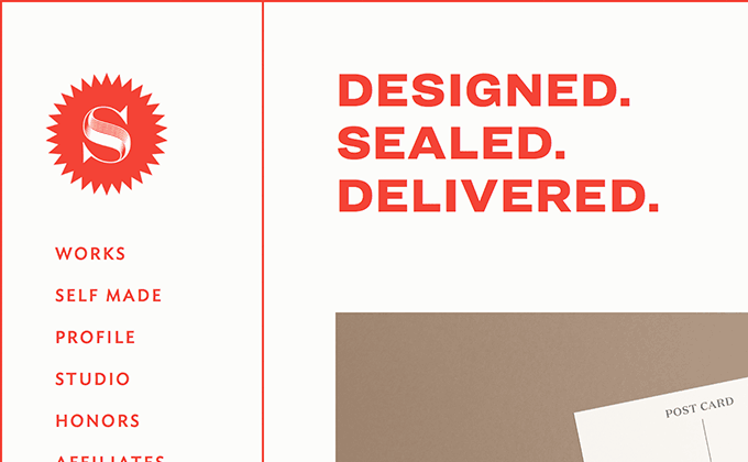
Seals
Tré Seals’ site uses five typefaces (six if you count what appears to be Obsidian used for the “S” logo), all from Hoefler & Co: Ideal Sans for the navigation, Ringside for the headers, Surveyor for pullquotes, Tungsten for dates and Operator for body text. Is that too many fonts? Maybe. But I absolutely love the design. It feels engaging. It feels like a brand. It doesn’t look exactly like every other site on the internet. This falls more in line with the Bethany Heck school of thought, which essentially comes down to use as many fonts as you want, just be consistent and use each font for a specific purpose. The web would be a much more interesting visual medium if designers went with this advice.
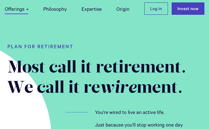
Wealthfront
A geometric sans paired with a chunky, high-contrast serif. This isn’t groundbreaking stuff, but for a financial services company it feels pretty fresh. Glosa Display from DSType has never been featured on Typewolf before, so it’s a little more distinctive compared to other high-contrast serifs we see used all the time like Freight Display. Calibre from Klim Type Foundry feels like it is starting to become the new Circular—I’ve been seeing it everywhere lately and it fits that similar “geometric sans that doesn’t look like Futura” description.
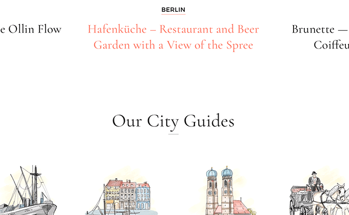
Creme Guides
It is becoming rare for the sites I feature here to use solely Google Fonts, but this site is a nice exception. There are still good fonts on the free service, even if they are becoming a bit cliché and overused. Cormorant was created as a display face, but the designer created a variant called Cormorant Garamond with larger counters to make it suitable as a text face. That’s the version used here and it reads decently despite how delicate the letterforms are. Montserrat is paired with it set in uppercase for the headers.
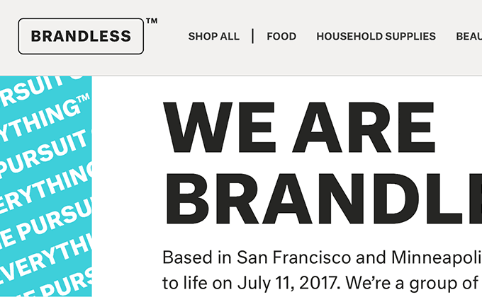
Brandless
Neutral is a sans-serif that was designed to be “free of all connotations or associations,” which the designer admits is an impossible task. But it does look about as plain and neutral as a font can get, at least based on my own personal cultural associations. It’s the perfect choice for a brand that doesn’t want to be a brand. But the absence of a brand is still in itself a brand—and a pretty strong and memorable one in this case.
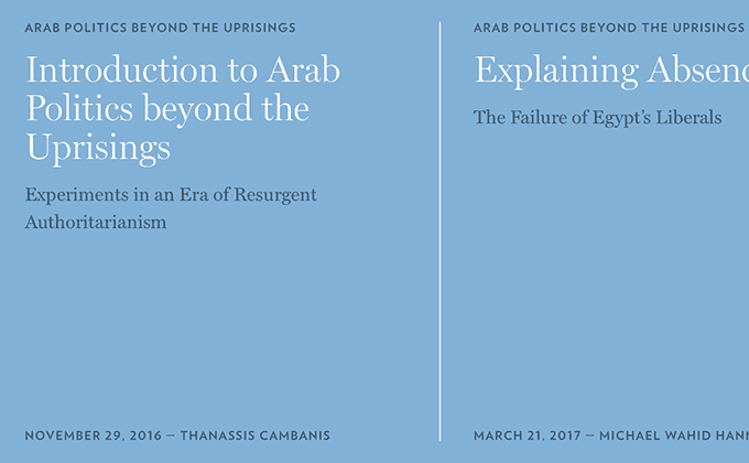
The Century Foundation
When I first saw this site I thought it looked like the work of AREA 17, one of my favorite agencies, and sure enough, that is who designed it. It feels similar to their work for Scientific American and Library of America: flawless type, ample whitespace, contrasting colors—just good graphic design. Two optical sizes of Matthew Carter’s Miller are used—the display version for headlines and the text version for body copy, as you would expect. H&Co’s Verlag rounds out the design, set in slightly letterspaced caps.


