
This is the 44th installment of my monthly feature on Typewolf where I share my favorite type-driven websites from the previous month and then write a little about the typographic details behind the designs. You can check out last month’s post for August here.
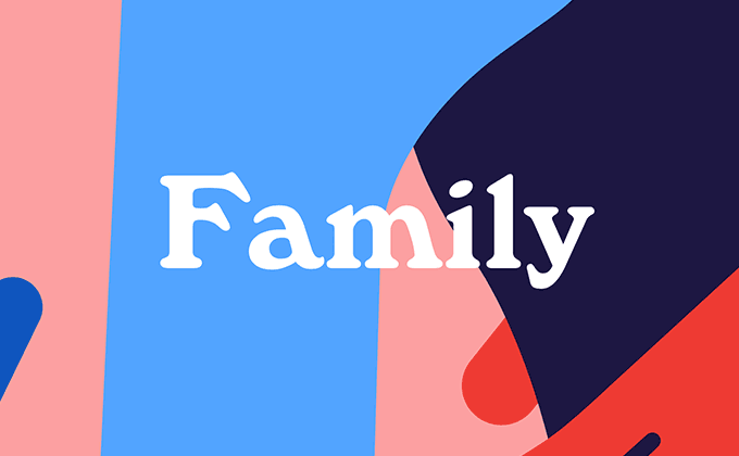
Inside the Head
Center-aligned text is often misused on the web, but in this instance it’s entirely appropriate as this is a poetry project. The poem text is set in the display cut of Farnham, as opposed to the text version, yet it still reads perfectly well for the short poems. Windsor, the lumpy serif used for the headers, was originally released in 1905 but seems to firmly recall the 1960s and 1970s as it was popular on album and book covers from that era. It has a warm, vintage feeling, especially in the bolder weights where the rounded corners make it feel soft and friendly. Poppins, a geometric sans-serif that is freely available on Google Fonts, is set in uppercase for the navigation, contrasting nicely with the other two typefaces.
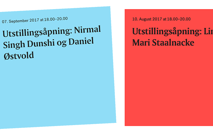
LNM
Amerigo is an inscriptional typeface with flared stroke endings designed by the famed Dutch designer Gerard Unger. It was released in 1986, but for some reason has been popping up out of nowhere on Typewolf lately, with three uses in the last month. It looks somewhat similar to Albertus but feels much smoother due to the less angular counters. It looks beautiful on the LNM site set against the solid blocks of color and even reads nicely for a few paragraphs of text. Post Grotesk, a sans-serif that fits somewhere between a neo-grotesque and an early pre-Helvetica grotesque, is used for the rest of the copy where its clean forms balance with the dramatic appearance of Amerigo.
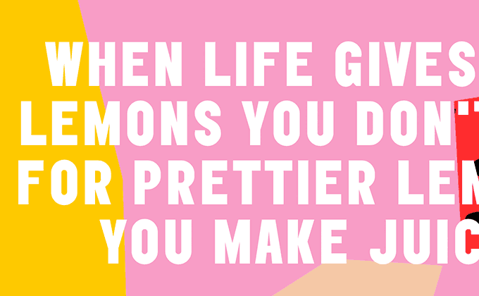
Misfit Juicery
Elephant is an unusual sans-serif that applies geometric shapes to the “irregular” grotesque genre, resulting in super quirky letterforms. The quirkiness of the shapes isn’t as prominent in the uppercase (the lowercase g from Elephant is one of the most unique letters I’ve ever seen), which is how the typeface is used on this site. It still feels pretty distinctive though and helps create a memorable brand for this juice company. The rest of the site is set in Monospace 821, which is essentially a monospaced version of Helvetica. Setting body text in a monospaced font isn’t usually the best option for readability, however, the copy on this site is pretty minimal, so it’s not much of an issue.
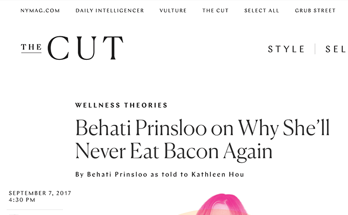
The Cut
Canela is probably the most fashionable typeface of the moment, with 18 uses on Typewolf in less than a year. The light weight is used for the headlines here, where it looks elegant and refined. Calligraphic sans-serifs like Chap are also pretty fashionable right now, so it makes for a nice pairing with Canela for the navigation and bylines. The bylines, which you can see an example of in the above screenshot, have added letterspacing which is generally considered a typographic faux pas for lowercase text. Sometimes adding letterspacing to smaller lowercase text can make it more readable, but in this case it may just be inadvertently inheriting the spacing from the uppercase style.
The body copy uses Georgia which feels a little uninspired—once you scroll down away from the headlines, some of the branding is lost and the design starts to feel more like a generic blog template. However, Georgia always reads well and it saves needing to load additional body copy fonts which often requires regular, italic, bold and bold italic styles.


