A few months back I published a blog post where I asked 41 influential designers to list their top 3 current favorite typefaces. Most of the designers seemed eager to name their favorites. However, after I published the article I heard comments along the lines of “if you have a favorite font you are doing it wrong”—meaning that without context it’s pointless to have a favorite font.
This got me thinking about what it means to have something be your “favorite” and whether or not context is always required for a designer to have a personal preference for something.
Are Fonts Nothing More Than Tools to Complete a Job?
After I published the favorite typefaces article I came across the following comment on Twitter:
Akin to asking carpenters what their favorite tool is. Never mind what they’re building.Twitter Guy in response to designers listing their favorite fonts
I definitely understand the point that person was trying to make however I disagree with the general sentiment. I think a typeface is more than a tool to complete a specific task or solve a particular problem. I think it’s certainly possible to have a favorite typeface outside of any specific context.
A designer might like the way the lowercase g is drawn in a typeface or love the italic ampersand in Baskerville. Designers regularly describe certain typefaces as “beautiful” which is a completely subjective term.
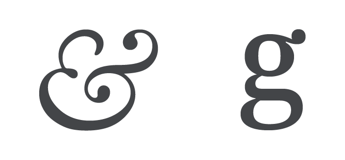
The italic ampersand from Baskerville and the g from Newzald.
These types of things touch on the more intangible aspects of design. The things that “feel right” even if there isn’t always a proper explanation of why. There is a place for logical and data-driven design decisions but I think a designer’s intuition is still important.
Type designer Erik Spiekermann has even said he admires type like other people might admire girls’ bottoms. Okay that might be taking it a little too far but maybe that is why Spiekermann is considered one of the most important type designers in history.
I’m obviously a typomaniac, which is an incurable if not mortal disease. I can’t explain it. I just love, I just like looking at type. I just get a total kick out of it: they are my friends. Other people look at bottles of wine or whatever, or, you know, girls’ bottoms. I get kicks out of looking at type. It’s a little worrying, I admit, but it’s a very nerdish thing to do.Erik Spiekermann in the movie Helvetica
Erik Spiekermann really likes type.
So I think a typeface can stand on its own as a work of design—it doesn’t need to be actively solving a particular design problem for a designer to appreciate it.
Also to go back to the carpenter analogy, I would imagine that many carpenters could name a favorite tool regardless of what they are building. There might be a certain hammer they like that is perfectly balanced and made from the highest quality materials. And goddamn they just love that hammer. And it might be for reasons only a carpenter would understand. I think the same thing can be applied to a designer having a fondness for a particular typeface.
Is Akzidenz Grotesk the Only Typeface You Need?
Early in my design career there was an older designer I worked with who used Akzidenz Grotesk almost exclusively. Whether it was a real estate client or a tech startup it didn’t matter. Other designers would spend hours on typeface selection but he always just went straight to his beloved Akzidenz Grotesk.
Fortunately he was a master at making the same typeface work in almost any context. Just by setting the type differently and applying color he could completely transform the look and feel of a design.
Our clients always loved his work. I don’t think our project managers ever realized it was all just Akzidenz Grotesk every time.
I’m not saying that every designer should just stick with one typeface forever but I think there is something to be learned from one-typeface-is-all-you-need designers like him. It’s possible for a single typeface to work in almost any context.
The perfect font combination—Akzidenz Grotesk combined with more Akzidenz Grotesk.
Does the World Really Need Another Grotesque Sans-Serif?
Every year some type foundry releases another sans-serif influenced by 19th century/early 20th century grotesques. Some designs clean up the “quirks” found in earlier typefaces to add “balance and consistency” while others purposefully add quirks to give the typeface “warmth and character” and prevent it from feeling too “sterile.”
Atlas Grotesk, Graphik, Vaud, Post Grotesk and Founders Grotesk are newish sans-serifs that probably look the same to 99% of the population (and even to some designers—I once worked with an art director who thought Arial and DIN looked identical).
Even if most non-designers wouldn’t explicitly notice the difference between these typefaces, I’d be willing to bet that on some level a design using these different typefaces would “feel” different to them, even if it is more on a subconscious level.
Vaud.
Founders Grotesk. Does the world need more grotesques? Yes, please.
So Why Are There New Typefaces Being Released Every Year?
Are there constant “improvements” being made? Is each new typeface released even more legible and finely balanced? Will there someday be a “perfect” typeface?
I think the reason we keep seeing new typeface designs every year is simply because each new design has a different aesthetic feel to it. Type designers look back into type history and combine ideas in new and interesting ways. New typefaces allow designers to create more distinctive work, even if on a very subtle level.
Granted, there have been new typeface releases that are created for specific uses, like reading on small, low-res screens (although this is less important with the rising popularity of high-density displays). However, most new releases we see are not created specifically for solving new design problems that pop up every year. They are purely aesthetic in nature.
Designers Shouldn’t Be Afraid to Have a Favorite Font
A typeface is more than a tool to complete a task—it’s a highly subjective form of communication and can even be considered an object of beauty.
I think it’s totally okay for designers to have a favorite font. If a typeface feels right to you and you connect with it on some level, then there is no shame in saying it is your favorite and there is no need to make up a pretentious explanation of why it is your favorite. “I just like it” is fine.
My favorite typeface is Newzald and my favorite color is blue.


