
I’m a huge fan of Samuel Hulick’s user onboarding teardowns so I thought it would be fun to try a new feature on Typewolf where I do a “typography teardown” of a popular website. I’ll review the design from a typographic perspective and discuss what makes the type work and what could potentially have been done better.
In this first edition I’m going to take a deep dive into the type behind the Advertising Age website. But first, a disclaimer.
Disclaimer: The following site was created by designers way more talented than myself. This is simply my opinion on the typography and how, at times, I may have approached things differently. Rules in typography are meant to be broken.
By all means break the rules, and break them beautifully, deliberately and well.Robert Bringhurst, The Elements of Typographic Style
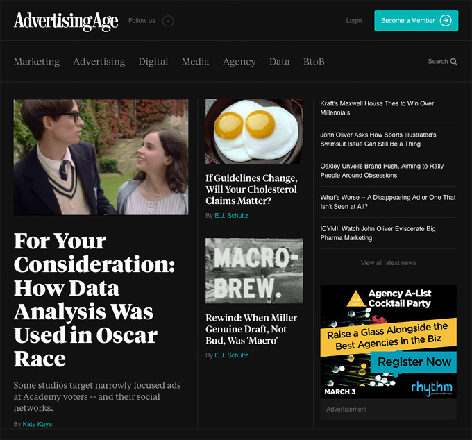
The Advertising Age homepage.
Advertising Age is a magazine dedicated to the latest happenings in the advertising industry. The first issue was published in 1930 and it continues to be popular in print as well as on the web. The site was designed by AREA 17, one of my favorite interactive agencies.
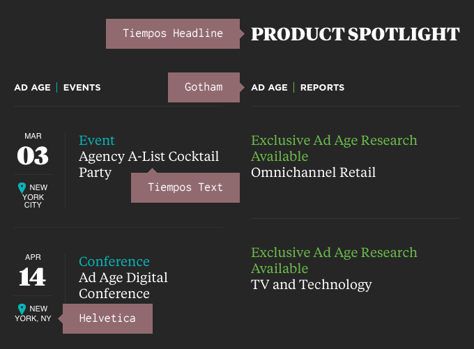
The typefaces used in the design.
The site uses the typefaces Tiempos Headline, Tiempos Text, Gotham and Helvetica. In my opinion, including two different sans-serif fonts probably isn’t needed. Why use Helvetica at all when you are already loading the Gotham font? Choosing just one sans-serif might add a little more consistency to the design.
It’s also a possibility that the small amounts of Gotham that appear in the design were left on the site unintentionally. They don’t appear to be using Hoefler & Co.’s Cloud.typography service and are instead hosting the Gotham font files themselves.
Tiempos Headline and Tiempos Text are the most prominently featured typefaces, used for headlines and body copy, respectively. The Tiempos family was designed by Kris Sowersby of New Zealand-based Klim Type Foundry. Surprisingly, much of the inspiration for Tiempos came from Times New Roman. I like this quote from Sowersby:
These days Times New Roman is much maligned. It’s easy to dismiss due to its ubiquity—being the default for a decade sunk it to the depths of bureaucratic banality. Which is unfortunate, for when it comes to the twin tenets of newspaper typography—economy and legibility—it still performs admirably. As Tiempos had to fulfill these same tenets, it was natural to look towards Morison’s classic Times New Roman, a forefather of modern newspaper typefaces.Kris Sowersby, Designer of Tiempos
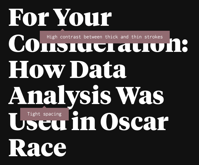
Tiempos Headline (enlarged to show details) has high stroke contrast and tight spacing.
Tiempos Headline is a display version of Tiempos, created specifically for setting headlines. It features higher contrast between thick and thin strokes and overall tighter spacing between letters. If used at small sizes these features could cause legibility problems, however, when used at large sizes they add a sense of refinement and elegance to the type.
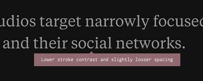
Tiempos Text (enlarged to show details) has lower stroke contrast and slightly looser spacing.
Notice how Tiempos Text has a more uniform stroke thickness (compared to Tiempos Headline) as well as slightly looser spacing. These features strip away some of the elegance but enhance the readability when set at text sizes. The designers of this site did a great job of consistently using Tiempos Headline and Tiempos Text for their intended purposes. It’s amazing how often I encounter sites using display faces for setting body copy, which is a recipe for a bad reading experience.
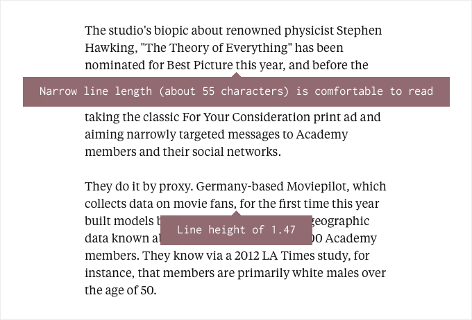
The line length of approximately 55 characters and line height of 1.47 makes for a comfortable reading experience.
Here is how Tiempos Text looks when used for body copy. Notice the comfortable line length (also known as measure) of about 55 characters. A 45 to 75 character line length is considered ideal for reading and the body copy on this site falls nicely in that range. It’s very common on the web for line lengths to greatly exceed that (especially for fluid layouts), so it’s nice to see that the designers added a max width so that the type remains easy to read, even on large screens like mine.
The line height (also known as leading) of the body copy looks good as well, coming in at about 1.47. Shorter line lengths require less leading than longer ones. For some reason web designers can tend to go a little overboard with the CSS line height setting. The default setting for line height may be a little too tight but that doesn’t mean you should go nuts with it. A line height of around 1.5 is usually considered ideal.
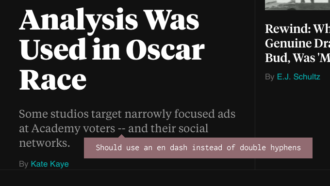
The double hyphens should be replaced with en dashes or em dashes.
I find it curious that this site uses double hyphens everywhere instead of en dashes. An em dash could be considered proper as well, depending on the editorial style. I prefer en dashes and tend to agree with Robert Bringhurst:
The em dash is the nineteenth-century standard, still prescribed in many editorial style books, but the em dash is too long for use with the best text faces. Like the oversized space between sentences, it belongs to the padded and corseted aesthetic of Victorian typography.Robert Bringhurst, The Elements of Typographic Style
To create proper dashes, use the following HTML entities:
En dash → –
Em dash → —
Content management systems can be set up to automatically convert double hyphens into en dashes, so this very well could be a case of the editors trying to input the proper dash but having the CMS not cooperate.
Also be sure to check out my typography cheatsheet for everything you need to know about properly using en dashes and em dashes.
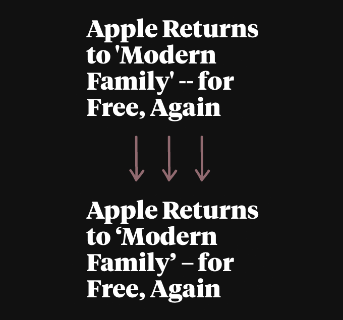
A headline tweaked to show how it would look with smart quotes and an en dash.
Straight quotes are used throughout the site instead of smart quotes. In body copy they aren’t that noticeable but in headlines they are hard to miss. In a few places smart quotes are used properly, so it makes me think the original designers of the site knew better and it’s more of an issue with the content management side of things.
In general, if your quotes and apostrophes are straight, they are dumb; if they are curly, they are smart. The “curliness” of course will vary from typeface to typeface but proper quotes almost never point straight up and down.
To create proper quotes and apostrophes, use the following HTML entities:
Opening single quote → ‘
Closing single quote and apostrophe → ’
Opening double quote → “
Closing double quote → ”
For much more detailed information about using smart quotes and apostrophes, check out my typography cheatsheet.
Do the uppercase headers look better with a slight amount of letterspacing added? Pretty subjective.
A standard “rule” of typography is to always add letterspacing when setting type in all caps. Smaller sizes of all caps text need more letterspacing and larger sizes need less. I find this rule to be pretty subjective. Depending on the look you are going for, sometimes you want your uppercase text to look tight. In this example, I think adding a bit of letterspacing enhances the legibility slightly, but overall is more a matter of personal taste.
Key Takeaways From This Teardown
- Combining a display (or headline) typeface with its text counterpart from the same family is an easy way to ensure readable body copy while still having elegant headlines but remember to never set body copy with a display font.
- Don’t combine two different sans-serif typefaces without a good reason.
- A 45 to 75 character line length is considered ideal for reading—don’t let the line length expand to fill the browser window.
- Aim for a line height of around 1.5—decrease the line height for shorter line lengths and increase it for longer line lengths.
- Be sure to use proper dashes, apostrophes and quotes—consider configuring your CMS to do this for you automatically. Remember: if your quotes and apostrophes are straight, they are dumb; if they are curly, they are smart.
- Adding slight letterspacing to type set in uppercase can enhance its legibility.
Stay Tuned for More Typography Teardowns
I’ll be writing more typography teardowns in the future, so enter your email below if you’d like to be notified when they are published. And be sure to visit Typewolf whenever you are in need of typography inspiration.


