This is the 11th installment of my monthly feature on Typewolf where I share my favorite type-driven websites from the previous month and then write a little about the typographic details behind the designs. You can check out last month’s post for November here.
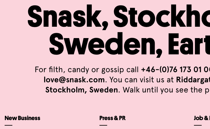
Snask
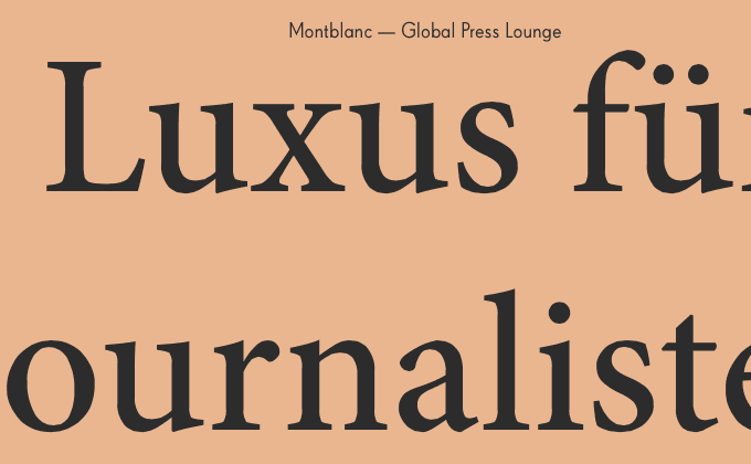
I remember the previous design of Snask was one of the first places I saw Apercu being used on the web. The folks at Snask are real trendsetters as this typeface has exploded in popularity over the last year or two. Their new redesign sticks with Apercu but adds in Platform, a geometric sans from Commercial Type. The bold weight pairs surprisingly well with Apercu. Lacrima Senza from Milieu Grotesque is used for the nav set in uppercase.
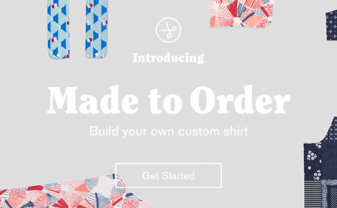
Gitman Vintage
The trend of 1970s-esque typefaces becoming popular again continues with the use of ITC Clearface on Gitman Vintage’s site. Although for a vintage clothing site, this style of font makes total sense. The sans-serif Maison Neue adds a touch of modernity. One odd thing I noticed—there appears to be letterspacing added to the body copy—I’m not sure if that was intentional or not but the spacing feels a little wide for comfortable reading.
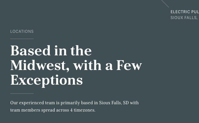
Electric Pulp
It’s nice to see a site using a font that isn’t commonly used like Kostic Serif—it definitely helps in creating a more distinctive brand. Adelle Sans, a more popular grotesque from TypeTogether, is used sparingly as the secondary font.
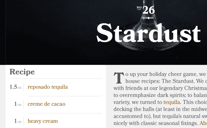
Tuxedo no.2
Bookmania is Mark Simonson’s revival of the Bookman faces popular in the 1960s and 1970s. I think it’s a great typeface choice for branding this site about classic cocktails. The swash styles used in the logo add a touch of vintage flair. I really dig the use of drop caps on the recipes pages—sometimes drop caps can be a bit overwhelming but these are implemented in a tasteful way.
Ape Unit
I love the mega-sized setting of Minion—it’s nice seeing the fine details of such a beautiful typeface. FF Super Grotesk is similar to the ultra-popular Brandon Grotesque, but feels much more distinctive and unique as it’s not used nearly as much. Together these two typefaces make for an interesting combination.
Thomas Schrijer’s Top 10 Albums of 2014
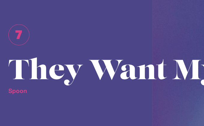
Lust is a “sensual” serif designed to be used at large sizes to show off its lustful curves. This site makes great use of it combined with the “Helvetica killer”, Aktiv Grotesk, which helps to balance out and anchor the ornate display face. Also nice to see Future Islands at #1.
The Local Palate
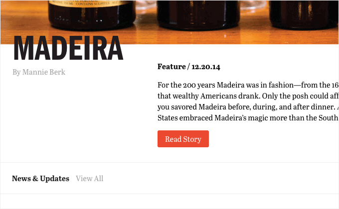
Franklin Gothic is set entirely in uppercase and combined with the serif Abril. Abril is interesting in that the display styles take on more of a classic Bodoni/Didone feel, while the text styles feel more like a slab serif in the Clarendon style. I really like how the type on the homepage overhangs slightly onto the photo—it makes the design feel more dynamic and less locked into a grid.
An Oral History of Boogie Nights
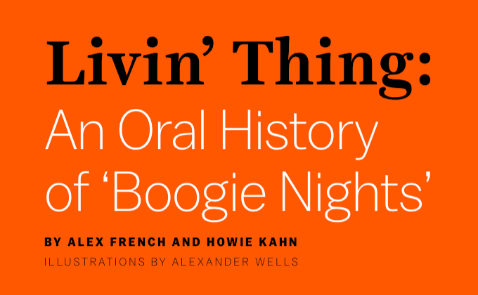
The “Livin’ Thing” title is set in the text style of Harriet rather than the display style one might expect from a large title like this. However, the display style might be a little too high-contrast when combined with the delicate light weight of Balto which might have been why the designers used the text style instead. This shows that just because a typeface has a display version doesn’t mean it’s always necessary to use it when setting titles.
The Many Faces Of… Sigourney Weaver
Another popular typeface of the 1970s, ITC Serif Gothic, makes an appearance on Paravel’s Sigourney Weaver tribute site. ITC Serif Gothic was used in the original Star Wars posters, so it definitely has a lot of sci-fi connotations which makes it the perfect typeface choice for this sci-fi focused design. It’s combined with Proxima Nova, which is starting to feel so ubiquitous and anonymous that it seems like it can be paired with anything at this point.
The Outpost
I’m really impressed by how closely the designers of this site were able to match the typography from the print edition of the magazine. Leitura News and Leitura Display were specifically created with editorial usage in mind and this superfamily looks absolutely beautiful on the web as well as in print.


