
This is the 12th installment of my monthly feature on Typewolf where I share my favorite type-driven websites from the previous month and then write a little about the typographic details behind the designs. You can check out last month’s post for December here.
Kim Bost
This is a simple site that uses a single typeface at a single size and weight. I think the key to making this work is the use of color—the white type adds much-needed contrast and the variation in the link underline color adds a warmth to the design. The poster style of Darby Sans, with its high contrast, refined lines, looks wonderful at large sizes.
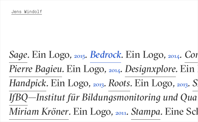
Jens Windolf
I love how Grilli Type has only a handful of typefaces available and each one expresses a unique idea and concept. GT Pressura Mono was inspired by the way ink spreads under pressure when stamped on shipping boxes. And the calligraphic serif, GT Sectra, combines the flow of a broad nib pen with the sharpness of a scalpel knife.
Large Glass
Schneidler is a classic serif from 1936 that is seldom used on the web. The distinctive cupped serifs really stand out when used at a large size like this. Mr Eaves Sans, the humanist sans-serif counterpart to popular serif Mrs Eaves, makes a great combo paired with Schneidler.
Pound & Grain
Pound & Grain take full advantage of Hoefler & Co.‘s Cloud.typography service, using three H&Co typefaces. I’m stoked to see them using the chunky slab serif Ziggurat so prominently—it’s definitely one of the more underused H&Co faces. Tungsten makes a nice font combination paired with it and Sentinel is used more subtly for body copy.
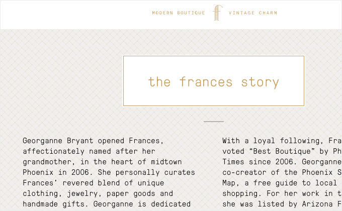
Frances
This is another site using Grilli Type’s GT Pressura Mono. The typeface is surprisingly flexible for a monospaced family—the type takes on a slightly different feel when set in uppercase, which makes introducing a second typeface into the design unnecessary.
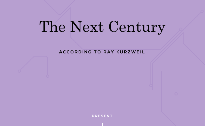
The Next Century
I think this design shows restraint by using the classic Century Schoolbook, rather than going with something more “techy” looking that might be a more obvious choice for a site about the future of technology. I love the use of Nexa as well—it’s much less used than similar faces like Gotham or Proxima Nova and it looks great combined with the monospaced Anonymous Pro.
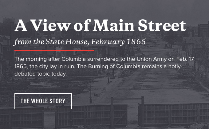
Burning of Columbia
It looks like the designers did an excellent job of matching the type from the print brochures with the type on the website using Galaxie Copernicus and Alternate Gothic. My only critique would be that in some places uppercase Alternate Gothic is used for buttons and then in other places uppercase Proxima Nova is used instead on the buttons. The design might feel more cohesive had they stuck to a more consistent type system. Other than that the type on this site is outstanding.
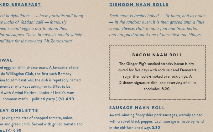
Dishoom
I really dig the combo of Cheltenham and Gill Sans. Gill Sans is a quintessential British typeface so I think it’s a great choice for this London chain of restaurants. I’m surprised by the use of Brandon Grotesque though. I don’t think it necessarily looks bad paired with Gill Sans, however, I’d be curious to know the reasoning behind the designers choice to introduce a second sans-serif into the design instead of just using Gill Sans throughout.
David Yeiser
I can tell that a ton of thought was put into setting the type on this site. Yeiser created a consistent type system and then stuck with it religiously throughout his site, creating a cohesive design. Tiempos Headline is used for headlines, Benton Sans is used for body copy with the wide cut used for navigation/subtitles and the monospaced Pitch is used for tables and auxiliary text.
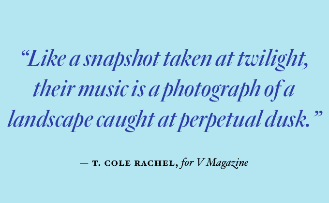
Palaxy Tracks
It can be risky mixing four different typefaces, however, if you can pull it off it makes for an engaging design for type lovers. H&Co’s new serif Quarto is used for the “Palaxy Tracks” masking effect along with the pull quote, Knockout is used for the “EST. 1995” line below the logo and the rest of the design is a mix of Gotham Narrow and Hoefler Text. It probably helps that the designer of the site actually works for Hoefler & Co. so it’s obvious he is quite proficient at working with their typefaces.


