This is the 32nd installment of my monthly feature on Typewolf where I share my favorite type-driven websites from the previous month and then write a little about the typographic details behind the designs. You can check out last month’s post for August here.
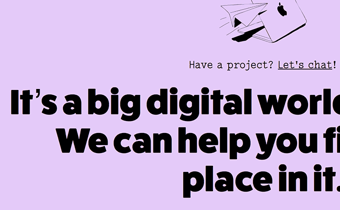
Kettle
FatFrank is a fat, blocky sans-serif from Dutch foundry Regular Bold Italic. Like most heavy faces, it contains tiny counters, so it works best when set at large sizes like it is here. Freight Sans is used for body copy and makes for a much more appropriate text face. Lacrima Senza, a vintage typewriter slab serif from Milieu Grotesque, is used for auxiliary text and contrasts nicely with the other two sans-serifs.
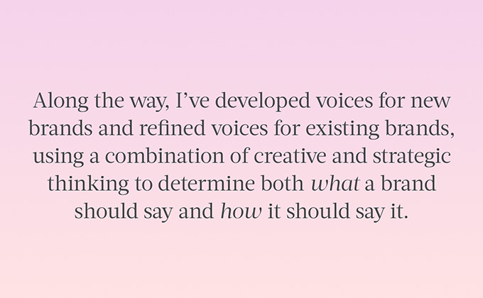
Christa Laib
Acta Headline is a display face, which means it was designed to be set at large sizes. It’s used for headlines here but also as a text face on the article pages. At text sizes, the stroke contrast is a little high and the spacing is a little too tight, so it’s not ideal for body copy. The Acta family does include a text version, however, that would entail loading additional fonts files which would add to the page weight. The body text is still set really well, with a perfect line length and line height, so it reads very nicely despite the fact that it’s using a display face. Pitch, a monospaced font from Klim Type Foundry, makes an appearance for dates and other small UI elements.
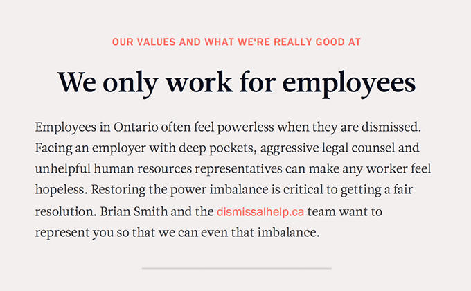
Dismissal Help
This site has a rather unique style for links—the linked text switches to Franklin Gothic in contrast to the surrounding text which is set in the serif Leitura News. Usually changing fonts in mid-sentence doesn’t work, however, in this case the x-heights match up perfectly, so the change feels fluid and seamless. It’s a nice touch that makes the type feel a bit more distinctive.
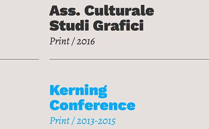
Maurizio Ilpiac Piacenza
Work Sans and Alegreya are arguably two of the best fonts on Google Fonts, so it’s nice to see the two coming together on Maurizio’s site. Work Sans has been blowing up lately and seems like it is heading towards overuse, however, Alegreya has been around for years and still feels under the radar. The huge headline type is set in the chunky, black weight of Work Sans and really shows off all the small details and quirks of the typeface.
Linecheck
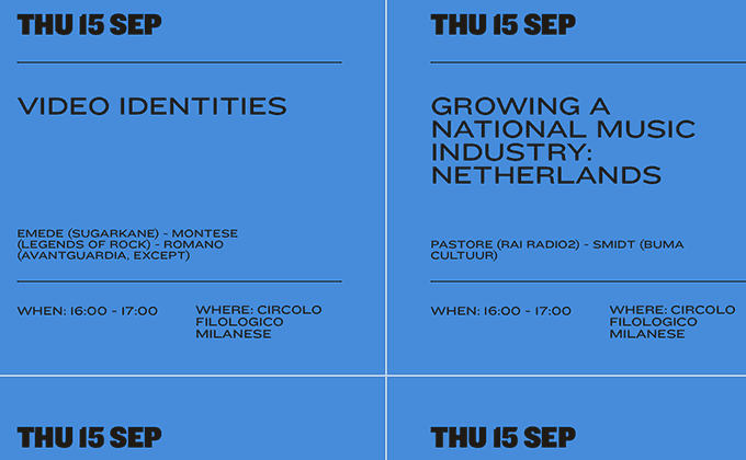
Knockout, from Hoefler & Co., is an eclectic sans-serif family that is available in nine widths and four weights, with each style given a boxing-themed name such as Junior Flyweight. The Linecheck site makes excellent use of the varying widths by jumping between the condensed and extended styles, creating a lively design using only a single typeface family. When set in uppercase, Knockout remains legible down to some pretty tiny sizes—parts of the homepage are set at 10px and still read well. The paragraph type is set justified which produces mixed results—the margins look nice and even but the word spacing can feel a bit erratic at times.
Stephanie Gonot
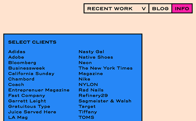
Stephanie Gonot’s photography features bold, saturated colors and the design of her site follows through with that aesthetic. Trio Grotesk has soft, rounded corners with wide proportions and generous spacing which gives it a sense of playfulness that complements the vibrant colors. The client list runs into a common layout issue—when the list items wrap onto two lines, they appear as separate items. For example, when Bloomberg Businessweek wraps to two lines, Bloomberg and Businessweek look like different clients. The solution to this is to tighten the line height while increasing the padding between items. Although in this situation, that may not be ideal as the list would no longer have vertical spacing that is consistent with the other boxes. This shows there are always compromises in typography.


