Update: You can view the 2015 version here or check out a more up-to-date selection of popularity lists here.
Welcome to the second annual edition of the ten most popular web fonts of the year as featured on Typewolf. For 2014, I have a full year’s worth of data with 365 sites being featured on the site. Last year’s list for 2013 was a little more curated and less backed by data as Typewolf hadn’t been around for a full year at that point.
This list features typefaces from all type foundries regardless of where the typefaces can be purchased or licensed, unlike other lists that might only include fonts available on certain sites such as MyFonts or Typekit. It’s still a curated list as I choose all the sites featured on Typewolf, however, with font usage data for 365 sites I think it shows a clear picture of what fonts were most commonly used in 2014.
Ok, on to the top ten…
10) Caslon
Apparently the old typesetter’s saying of “When in doubt, use Caslon” applies to the web as well. The various revivals of William Caslon’s work from the 18th century continue to be popular in the digital world of the 21st century.
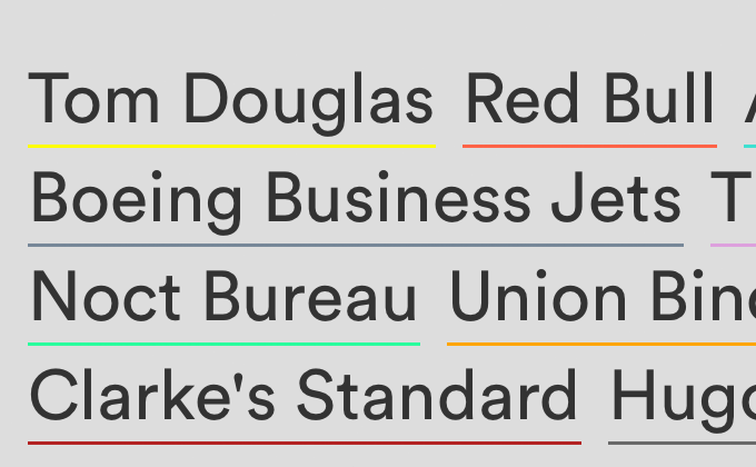
9) Circular
This geometric sans from Lineto really took off in 2014 thanks to its prominent use in a few big rebrandings from companies like Airbnb and Mint. I think it brings a touch of freshness to the geometric sans genre without deviating too much into unfamiliar territory. Laurenz Brunner’s other well-known typeface, Akkurat, has been a favorite of designers for years and I’m sure Circular will be as well.
8) Gotham
In 2014, Hoefler & Co’s Cloud.typography service finally started to see more widespread usage. Although their flagship typeface Gotham was one of the most used web fonts of the year, their other offerings such as Sentinel, Whitney and Archer have been quite popular as well.
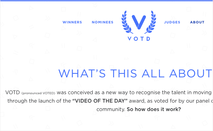
7) GT Walsheim
GT Walsheim, from Swiss foundry Grilli Type, is similar to other geometric sans such as Circular, but isn’t afraid to bring on the quirks. The horizontally protruding bar on the G and the curvy tail on the y give it a distinctive look that adds a bit of warmth and friendliness to a geometric typeface that could otherwise feel cold and sterile.
6) Franklin Gothic
Franklin Gothic has a long history as a classic editorial typeface in print, so I’m glad to see it used more for editorial purposes on the web, like on Time Magazine’s site. It’s also a noted favorite font of “the Godfather of the web”, Jeffrey Zeldman, so it’s fitting that it makes the list of the most popular web fonts of the year.
5) Proxima Nova
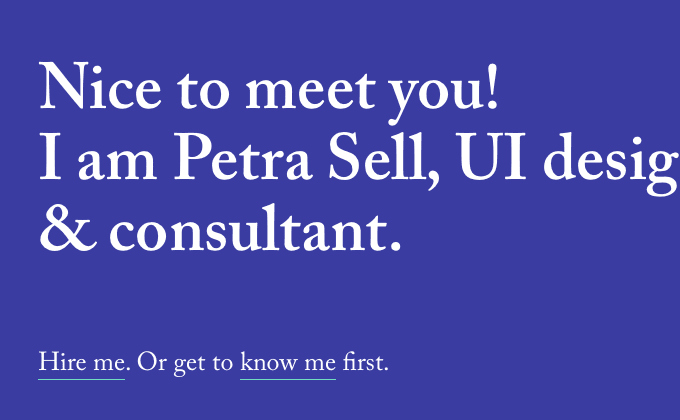
On last year’s top ten list, I predicted that Proxima Nova would fall out of style for 2014. I couldn’t have been more wrong. This typeface continues to be a staple on the web. I think due to its ubiquity it’s starting to feel almost anonymous, like Helvetica, where it can be used for any type of design and fit right in.
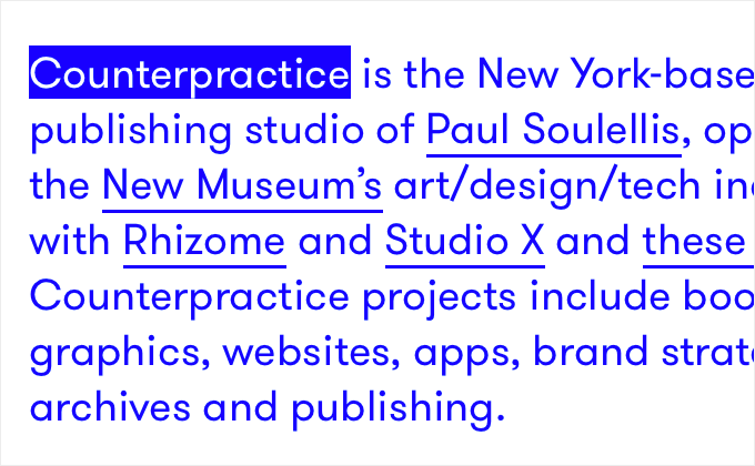
4) Apercu
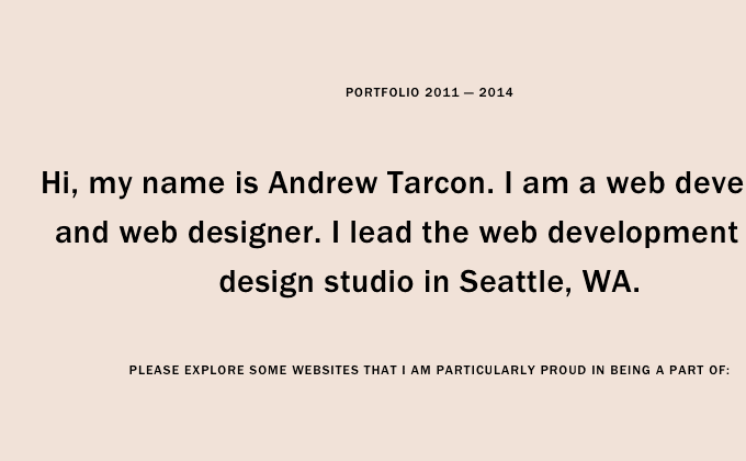
Apercu was #2 on last year’s list and I predicted it would start to feel a little played out in 2014 due to it being used absolutely everywhere. Of course “played out” is entirely subjective, but I feel like this prediction rings true. It could easily have reached #1 on this list, however, I personally started to not feature sites using it as they all seemed to be carbon copies of each other. If you use Apercu, will users of your site think the font is overused? Probably not, so don’t let its popularity stop you from using it. But to someone who looks at type all day long it no longer feels fresh and exciting.
3) Avenir
Adrian Frutiger considered Avenir his best work and this typeface has other admirers as well—I published a survey in April of last year where I asked 41 influential designers to list their three favorite typefaces and Avenir was mentioned the most. It doesn’t feel “trendy” like some other typefaces on this list can tend to feel; it instead has a timeless quality that I believe will make it popular for years to come.
2) Futura
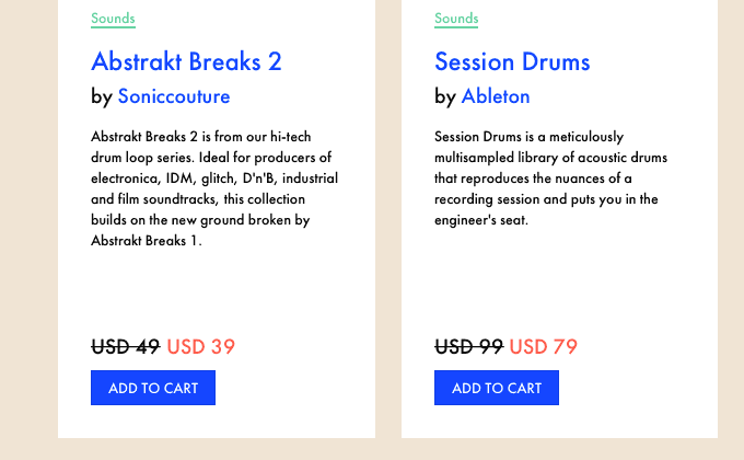
Speaking of timeless typefaces, Futura has seen widespread usage since it was released in 1927 and it continues to be popular on the web. Although it has a classic look, it’s not the most readable of typefaces due to its low x-height. It may be worth checking out some alternatives to Futura if you are in need of something more flexible.
1) Brandon Grotesque
It’s no surprise to anyone who follows type that Brandon Grotesque made it to #1 on this list. Last year I complained that too many sites were using it where the typeface felt a little out of place for their brand. Media Temple, a web hosting company, switched to Brandon Grotesque earlier this year for all of their branding. To me it feels odd seeing a tech company branding themselves with a typeface that has roots in architectural lettering of the 1920s. The typeface used to have a certain “feel” to it, to me at least, but that feeling is starting to become lost due to it being used everywhere, for every conceivable type of brand. But of course these kinds of feelings are subjective and typography and culture are always shifting and changing—typefaces will always have different connotations to different people.
Key Takeaways
I think one of the key takeaways is how diverse the use of web fonts really is. The most popular font on this list, Brandon Grotesque, was used on 21 out of 365 sites featured which comes out to only 5.7% of all the sites featured on Typewolf. I complained that it was overused, but really, font usage is still pretty diverse on the web which is certainly a good thing.
I also noticed less free Google Fonts being used in 2014—last year’s list included four and this year there are zero. I don’t think this means that Google Fonts are being used less in general, just that the type of sites featured on Typewolf have been looking for more distinctive and perhaps higher-quality options.
Keep Up With the Latest in Web Typography for 2015
Be sure to follow Typewolf if you want to keep up with the latest happenings in web typography. You can sign up for the monthly newsletter below or follow Typewolf on Twitter or Tumblr.
Thanks for reading.


