Update: You can check out the 2014 version here →
The use of web fonts has continued to explode in 2013—designers are no longer content with using standard system fonts like Arial and Georgia. On my side project Typewolf, I categorize the latest website designs by the web fonts they use. These are the ten most popular fonts I’ve noticed from analyzing font usage on Typewolf in 2013.
10) Proxima Nova
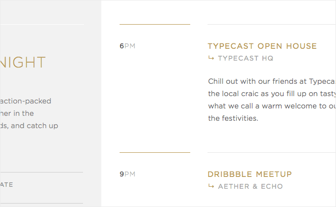
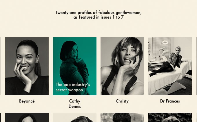
Proxima Nova may well be the most commonly used web font on the internet. I’m placing it at number 10 because it feels like it may be on the way out for 2014. It seems like every new startup sets its headers and navigation in uppercase Proxima Nova bold with slight letterspacing. It’s a popular font for good reason and the fact that it is popular shouldn’t necessarily stop you from using it—if it makes sense for your project then go for it. However, it might be worth looking at other fonts to use for your next design in 2014 if you want something more unique.
9) Gotham
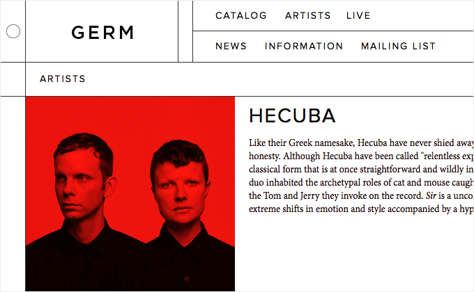
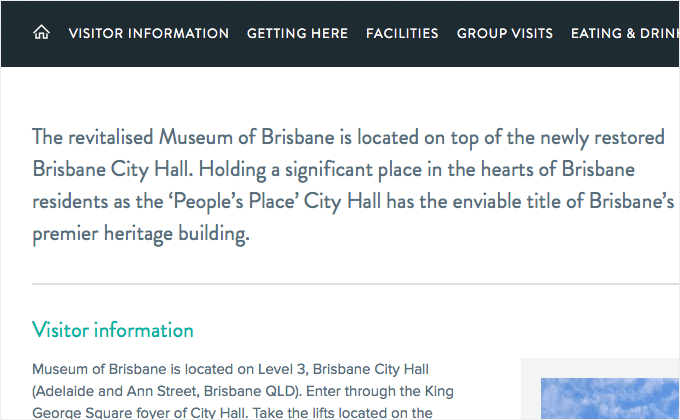
H&FJ were late to the game with their web fonts service. Gotham has been insanely popular for years in the offline world but just recently has been made available as a web font. I think part of the reason Proxima Nova became so popular is because of its similarities to Gotham. Gotham was used throughout Obama’s 2008 presidential campaign and since then can be found absolutely everywhere. Proxima Nova was available early on as a web font when Gotham wasn’t, so its growth online took off while Gotham was left behind. Fortunately all the time H&FJ spent working on their web font service was worth it—their fonts have been redesigned for the screen and render beautifully. In 2014, expect to see way more H&FJ fonts used on the web like Sentinel, Archer and Whitney.
8) Roboto
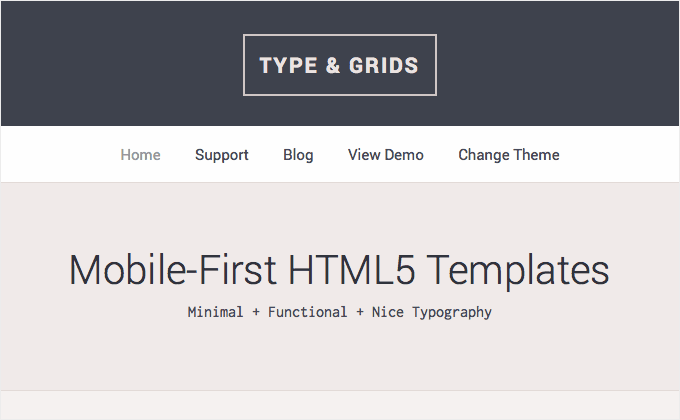
Roboto is a grotesque sans-serif that feels like something in-between Helvetica and DIN. It is a free font that is available in six weights with matching italics—it acts as an excellent alternative to other free sans-serifs, such as Montserrat, that lack italics. Roboto renders crisply on the screen at small sizes, so it works great for setting readable body copy.
7) Inconsolata
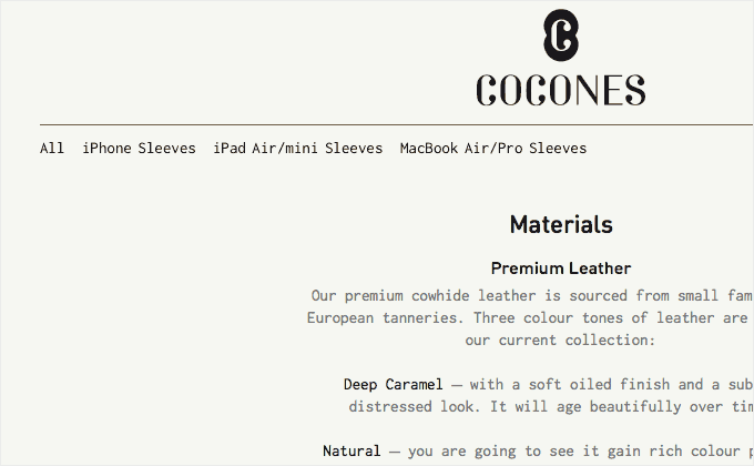
Monospaced fonts like Inconsolata continue to be popular with designers. Although originally designed for on-screen use and specifically for programming applications, monospaced fonts can be found everywhere. They can give a design a very sparse and “undesigned” feel. I see monospaced fonts used a lot on designer’s portfolio sites. Inconsolata is very well-designed for a monospaced font and looks great in the right context. It doesn’t include italics so it isn’t very well suited for body copy—a nice alternative to Inconsolata is Anonymous Pro (designed by Mark Simonson of Proxima Nova fame) which contains full italics.
6) Avenir
Avenir has been a personal favorite font of mine for years. I remember using it all the time in my design comps in the mid 2000’s—back when we had to slice up graphics to use nice fonts on the web. It seems like Avenir is emerging as a popular alternative to the ubiquitous Proxima Nova. Avenir has a very organic and welcoming feel for a geometric sans-serif and I’m sure its popularity on the web will continue to grow in 2014.
5) Futura
Futura has been around since 1927 so it feels a little weird including it on a list of the trendiest fonts. It’s a classic font that was much loved by Stanley Kubrick and Wes Anderson. Futura is clearly not going anywhere and will continue to be a popluar typeface on the web.
4) Montserrat
Montserrat is a free font which no doubt is part of the reason for its popularity. I always see it recommended as a “free alternative to Gotham”. It may have a similar feeling as Gotham but I think it really stands as its own typeface. It has a distinctive uppercase G and J which lends it its own unique character. Without italics it’s not the best choice for body copy, but it makes an excellent font for headlines.
3) Brandon Grotesque
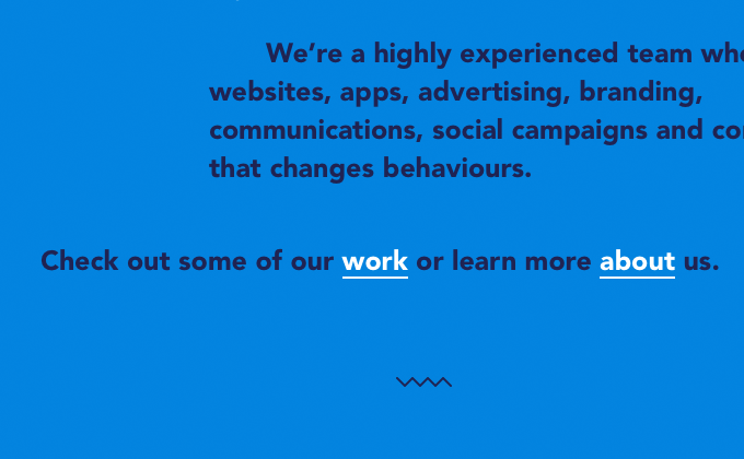
Brandon Grotesque is a geometric sans with a “1920’s New York” feel to it. It works wonderfully in the right context, however I personally feel I see a lot of sites using it where it doesn’t really seem to fit the design. Uppercase white Brandon Grotesque set on top of a darkened blurry photo background has to be one of the most common design treatments I’ve seen in 2013.
2) Apercu
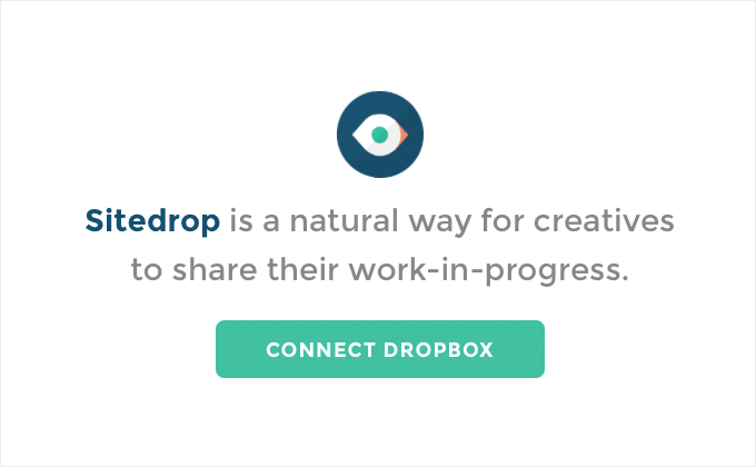
Apercu is yet another geometric sans-serif but with a much more distinctive twist to it. It has quirky characteristics that make it instantly recognizable yet it still retains a classic feel. On Typewolf, I know I’m guilty of featuring any clean design set with Apercu, as something about this typeface just seems so refreshing. Will it become played out in 2014? Yeah probably, but for now I’m really digging Apercu.
1) Open Sans
Open Sans is the new Arial. For a completely free and open-source font, it contains a surprising set of weights with matching italics making it an extremely versatile font. It works well for headlines as well as body copy and it renders excellently on the screen and at small sizes. The web has completely embraced Open Sans as it seems to be the default font for every recent open-source project. The newly-released Zurb Foundation 5 switched to Open Sans from Helvetica as the default font for its framework. Google is using it on many of their redesigned pages. I was always partial to Adobe’s similarily open-sourced font, Source Sans Pro, but that font hasn’t quite taken off like Open Sans has. I fully expect Open Sans to be as common on the web as Arial over the next few years.


