
This is the 16th installment of my monthly feature on Typewolf where I share my favorite type-driven websites from the previous month and then write a little about the typographic details behind the designs. You can check out last month’s post for April here.
Not To Scale
I think this site is interesting in that it uses two typefaces from Hoefler & Co, Quarto and Mercury, but the third typeface, Akkurat, is from Lineto. It made me realize that what’s missing from the H&Co catalog is a design in the DIN meets Univers style. That style of typeface seems to be growing in popularity—think Google’s Roboto and Apple’s new San Francisco typeface. Although I doubt H&Co has plans to release any kind of interpretation of that style as they seem to do their own thing regardless of what is trending at the moment.
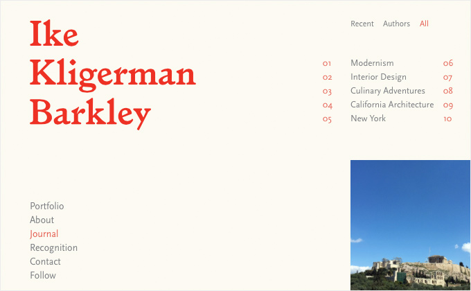
Ike Kligerman Barkley
The Ike Kligerman Barkley logo uses Radim Pesko’s distinctive serif Larish Alte. The rest of the site uses FF Scala Sans. This is the first time I’ve seen FF Scala Sans used on the web but I remember it being used in Bringhurst’s The Elements of Typographic Style. The type in the navigation runs a little on the small side, however, the body copy is a nice size for comfortable reading which is what is most important. I think FF Scala Sans makes a wonderful body text face so I hope to see it used more on the web.
Sand & Such
For a minimal site design like this, I think choosing a distinctive typeface is so crucial for branding. Colophon Foundry’s Fortescue is the sole typeface used and it works wonderfully as the main branding element of the site.
Cereal
This is the first time I’ve seen 9px type used for navigation in as long as I can remember. Thankfully it is letterspaced generously which helps with legibility, but damn, it’s still pretty tiny. But what this site lacks in readability it makes up for with its elegant and graceful aesthetic. Humanist sans-serifs like Gill Sans always go well with Old Style serifs like Garamond.
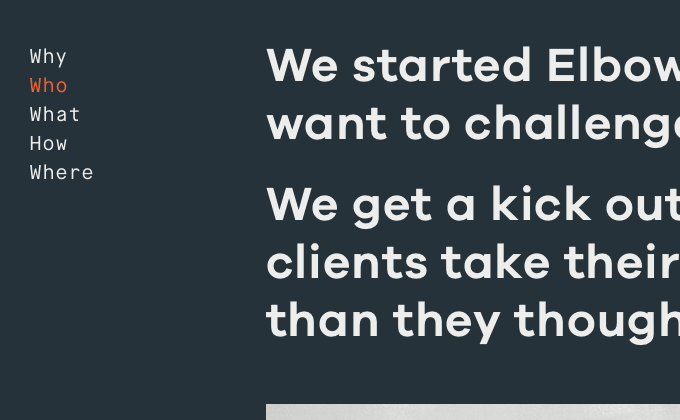
Elbow
With so many sites using Proxima Nova and Gotham, I applaud Elbow for going with something different. Galano Grotesque is a new geometric/grotesque hybrid that Rene Bieder released last year. On first glance, it appears similar to Gotham, but if you look closer you’ll notice quite a few quirks that give it more personality, like the more prominent tail on the “t.” A monospaced font, Maison Mono, is used for setting body copy which is an untraditional approach. It’s not a very text-heavy site though so I think that it works just fine.
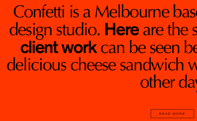
Confetti Studio
I feel like Hermann Zapf’s Optima might be making a comeback, at least on the web. Bondfire used it in their latest redesign and Confetti are using it as well. It’s a face that has commonly been used for beauty products in the physical world, so seeing design agencies use it on the web feels strangely avant garde. On Confetti’s site they mix it with Akzidenz Grotesk, using an extended style for navigation and headers.
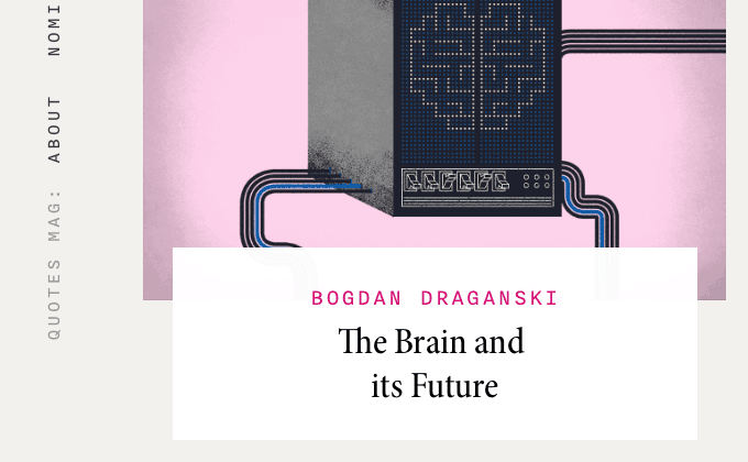
Quotes Magazine
I really dig the condensed cut of Minion used for the headlines—I think it goes great with the logo which is set with a heavy weight of Romana. Romana is the same typeface used in the Typewolf logo but you’ll notice that the heavy cut has quite a different feel to it. This is another site this month that is setting body copy with a monospaced font, in this case Nitti from Bold Monday. There is quite a bit of text to be using a monospaced font, however, Nitti is a fairly readable face and the type is set well with adequate line height so I don’t think it really hinders the readability too much.
Bone and Gold
With its wide letterforms, Sweet Sans looks best set in uppercase and remains legible even at small sizes like on the Bone and Gold site. Sweet Sans is based off engraver’s lettering templates so I think it makes for a perfect combination with Grilli Type’s sharp, calligraphic GT Sectra. Maison Neue from Milieu Grotesque is used for the minimal amounts of body text.
Bruce Gillingham Pollard
This is yet another site this month that uses super small type—maybe I’ve just gotten used to sites setting 18px+ body text so anything below 14px is starting to feel small. Despite the small size, the body text set in Univers still remains readable as the paragraphs are set with a narrow line length along with a generous line height. The choice to use Typonine Stencil for the large headlines was pretty clever—the “Bruce Gillingham Pollard” logo has subtle notching in some of the letters that resembles stencilling, so it’s a great way to carry that look throughout the design. I also like the choice of Typonine Stencil because it’s one of the few stencil typefaces that can pull off an elegant look as opposed to the “stamped on a crate” look. The use of Baskerville in the subheaders pairs nicely with it as well.
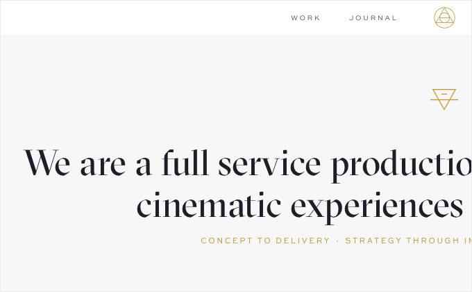
Work & Co
The type on the Work & Co site is truly top notch—the type is set impeccably with proper dashes, smart quotes and apostrophes and you can tell a lot of care was put into the spacing and layout of the type. I love the contrast of such a modern site design with typeface designs that originated before the twentieth century—Garamond and Akzidenz Grotesk. I also have to comment on the unique site navigation—oftentimes using “creative” navigation like this ends up being a nightmare for usability, however, in this case it is refreshingly simple and intuitive.


