Update: You can check out a more up-to-date selection of popularity lists here.
Welcome to the third annual edition of the ten most popular web fonts of the year as featured on Typewolf. Based on font usage data from 365 websites featured over 2015, these are the ten fonts that were used the most often.
While reviewing the data for this year, I noticed something a little disconcerting: this year’s top ten list is almost identical to the top ten list from 2014. Other than swapping out Franklin Gothic with Brown, these are exactly the same ten fonts that were featured the most on Typewolf last year.
I curate all the sites featured on Typewolf—so I may be partially to blame for this—however, the sites I feature tend to be a solid representation of what is popular in the design community. About one-third of the sites featured are submissions that people send to me while the remaining two-thirds are sites that I find featured on other popular design gallery sites, Designer News, Twitter, etc. Overall, I think this list generally shows what fonts are most popular with designers at the moment.
So in the spirit of hopefully making type a little more diverse on the web, I decided to list four alternatives for each of the ten fonts featured here. The alternatives all fit a similar aesthetic yet aren’t used quite as much. They may be worth looking into if you want to stand out a little from the crowd.
As always, this is an independent source of data that includes all fonts regardless of where the fonts can be purchased (including indie foundries that don’t make their fonts available on popular services such as MyFonts and Adobe Fonts (Typekit)).
Ok, on to the top ten!
10) Circular
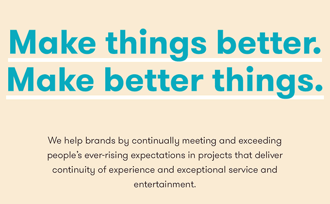
Spotify rebranded in 2015 and started using Lineto’s Circular throughout their website. Although their new shade of green garnered quite a bit more attention than their new typeface, I feel like this was a huge moment for Circular, where it finally went from being an underground favorite to a mainstream hit. Mint and Airbnb had previously rebranded with Circular but the use on Spotify felt like the tipping point. I imagine we will see it used much more in 2016. Similar to Circular, the alternatives below have geometric skeletons combined with more grotesque-like characteristics. They each feature a double-story a and a single-story g.
Fonts You Can Try Instead of Circular
9) GT Walsheim
Fashionable London-based art and design mag, It’s Nice That, rebranded using GT Walsheim in 2015 which is a testament to its popularity with designers. Many other designer portfolio sites and agencies jumped on the GT Walsheim bandwagon as well. The typeface feels like a more friendly version of Futura, so if that is your thing, check out these other four alternatives below.
Fonts You Can Try Instead of GT Walsheim
8) Brandon Grotesque
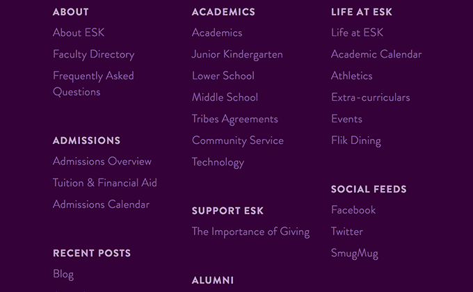
Brandon Grotesque was #1 on last year’s list but this year it has fallen to #8. I think maybe it is finally starting to feel a little played out. It seems ubiquitous on the web—everyone from web hosting companies to tech magazines to schools to fashion brands have been using it these last few years, so it really doesn’t feel as unique as it once did. Some of the alternatives below are worth looking into if you are looking for something more distinctive.
Fonts You Can Try Instead of Brandon Grotesque
7) Caslon
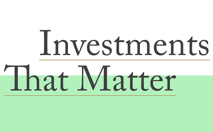
As the lone serif typeface on this list, Caslon feels a little out of place. There are many other classic serifs that everyone loves, such as Garamond and Minion, but for some reason it is Caslon that keeps making an appearance over and over again on Typewolf. I honestly can’t tell you why. Maybe designers are following When in doubt, use Caslon a little too religiously.
Fonts You Can Try Instead of Caslon
6) Avenir
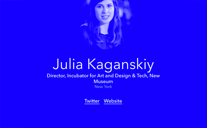
Avenir is almost universally mentioned as a favorite amongst designers so I’m really not surprised that it made the top ten list again this year. Adrian Frutiger sadly passed away in 2015 but Avenir will live on forever.
Fonts You Can Try Instead of Avenir
5) Brown
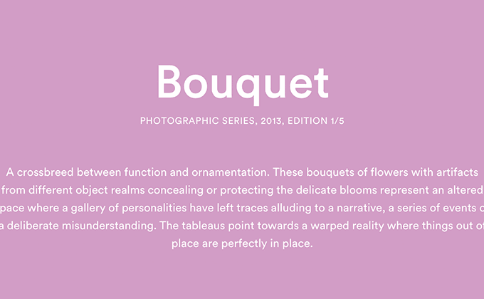
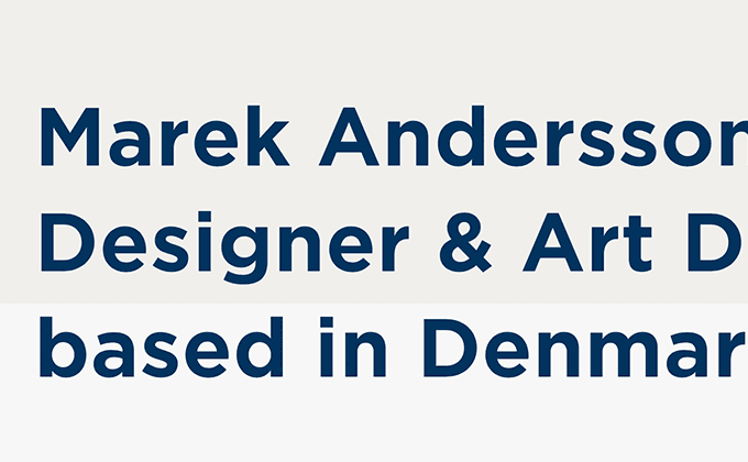
Brown is another typeface that fits the “friendly Futura” description, although it feels quite a bit different than GT Walsheim above. There really weren’t any big brands that I’m aware of that started using Brown on their sites in 2015, however, it continues to be popular with the more artsy crowd.
Fonts You Can Try Instead of Brown
4) Gotham
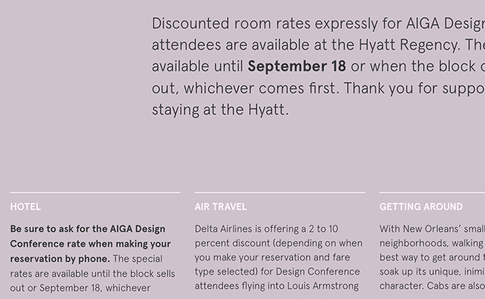
Gotham was #8 last year and this year it moved up to #4. It’s one of the most iconic typefaces of the last decade and continues to be popular on the web. Other typefaces from Hoefler & Co. like Sentinel and Whitney have been popular as well, however, I’m surprised by the relative absence of Archer on the web. I didn’t feature a single site using Archer in 2015 which is shocking as Archer is seemingly everywhere in the offline world.
Fonts You Can Try Instead of Gotham
3) Proxima Nova
It’s no surprise that Proxima Nova made the list again this year. It just edged out Gotham to take the #3 position. I keep thinking that Proxima Nova will fall out of favor, yet every year designers continue using it.
Fonts You Can Try Instead of Proxima Nova
2) Aperçu
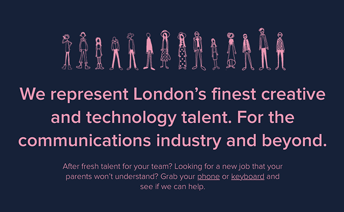
Aperçu is a really unique typeface that bounces between genres. Colophon describes it as a mix of ITC Johnston, Gill Sans, Neuzeit and Franklin Gothic. It’s the one sans-serif on this list that deviates the most from the geometric sans genre. Norwegian Air rebranded using Aperçu in late 2015 so it feels like it’s starting to hit the mainstream.
Fonts You Can Try Instead of Aperçu
1) Futura
The mother of all the geometric sans-serifs featured above, Futura was the most popular font featured on Typewolf by a landslide. There were almost twice as many sites using it as second place. Futura is readily available on Typekit which I’m sure has a little to do with its popularity. I think it’s neat that a typeface from 1927 dominates the web in 2015. Over the years there have been many typeface releases touted as “improvements” to Futura, with more contemporary proportions and larger x-heights, yet designers continue to reach for the original. There are many, many alternatives to Futura, however, the four typefaces below are a good place to start.
Fonts You Can Try Instead of Futura
The Year of the Geometric Sans-Serif
I’m going to make the understatement of the century: geometric sans-serifs are popular at the moment. Out of the ten fonts on this list there was only one serif featured, with the rest being sans-serifs. Although some of the typefaces such as Aperçu and Avenir deviate slightly into humanist territories, pretty much all of these sans-serifs could be described as geometric.
Why Are Geometric Sans-Serifs So Popular Right Now?
It’s difficult to explain broad cultural trends so I’m not going to even attempt to do that. However, a more mundane theory that could at least apply to type on the web, is that geometric sans-serifs feel more “exclusive” and therefore more “cool.”
For whatever reason there aren’t many geometric sans-serifs available on Google Fonts. Most of the popular ones fall into the humanist genre, such as Open Sans and Lato. There aren’t really any standard system fonts that are geometric either (although that is now changing with San Francisco and Roboto).
So if you are using a geometric sans-serif on your site, there is a good chance you had to pay money to use it. Having to pay money for something makes it more exclusive and unique. Brands that have a lot of resources to invest into design don’t mind paying money for nice type—especially if it will make them stand apart from “cheaper” competitors. This exclusivity could be one theory as to why geometric sans-serifs are so popular right now.
People are just sick of Helvetica could be another perfectly valid theory as well.
Predictions for 2016
I imagine geometric sans-serifs will remain popular for the next several years at least. The one thing I’ve learned about trends in type is that it takes years to notice any major cultural shifts. It’s not like neo-grotesques are all of a sudden hot one year and then become uncool the next. Type trends move slowly.
I think we’ll continue to see more serifs used in 2016. Serifs such as GT Sectra, Lust, Quarto, Portrait, Freight Text and Tiempos Text seem to be gaining in popularity but didn’t quite make the top ten this year. Sans-serifs have traditionally rendered better than serifs on computer screens due to their simpler structure, however, with higher density displays becoming more common, I think serifs are due for a big comeback on the web in the coming years.
I also would like to think that we’ll see a more diverse use of type on the web in 2016. There are thousands and thousands of quality typefaces out there so I’m hoping designers will dig a little deeper during the type selection process. The alternatives listed above are a good place to start and for the more adventurous, browsing Typewolf’s Site of the Day section may be a good way to discover some hidden gems.
Keep Up With the Latest in Web Typography for 2016
Be sure to follow Typewolf if you want to keep up with the latest happenings in web typography. You can sign up for the monthly newsletter below or follow Typewolf on Twitter, Facebook, Pinterest and Tumblr.
Thanks for reading and have a wonderful 2016.


